Sunday, January 31, 2010
Aidan Chopra (sketchup for dummies)
In the field of education, there is a debate going on about the best teaching practice according to one's preference. It seems that after evaluation, articles are being published showing that there is few evidence that someone that would be visual will actually benefit from visual materials. I am wondering what kind of evidence would be needed to support either assertion. I have been playing with sketchup and couldn't figure it out (I was only able to draw some boxes) until I came across some videos b Aidan Chopra the author of sketchup for dummies. I don't have the book but they were still useful. If you do a search in youtube you will be able to find them. I will post my modern accomplishment later...it's kind of fun!

Wednesday, January 27, 2010
HBO Multimedia
Hey guys,
Here's the link to that HBO site I showed in class the other day.
http://www.hboimagine.com/#/the_affair/
Also, just wanted to thank everyone for their input. Anymore ideas anyone has will always be appreciated. Thanks!
Here's the link to that HBO site I showed in class the other day.
http://www.hboimagine.com/#/the_affair/
Also, just wanted to thank everyone for their input. Anymore ideas anyone has will always be appreciated. Thanks!
Real object to 3D Model
We talked about objects in real world mapped to virtual world today. And while browsing I found this 2009 work by someone in University of Cambridge of a fast way to model your object and use the real object to interact with your virtual object..which can be whatever you want..with different textures. For people who want to see the video before the details: here's one on youtube. And here's : link to university for further reading.
Tuesday, January 26, 2010
Simulating illusary self motion
Some scientist experimented with floor projection in a virtual immersive environment, tried to study illusion of vection- self motion.
For people who do not know, vection refers to the perception of self-motion induced by some visual stimuli. The most familiar example of this sensation is that if one is seated in a train parked at the station while the train next to it pulls out from the station, one may have a sustained sensation that one is moving in the opposite direction.
So anyways, coming back to them scientists and their floor projection.This kind of projection helped them manifest linear vection, but not circular vection- the "real" illusion in our known world :)
So they tried a new thing- curvilinear forward vection which turned out to be more convincing experience. If you want to read further: CMU Research Paper
Here's what it looked like:

and,


Irvika's collage

My collage is an attempt to modify a map of Haiti showing how mother nature conspire to destroy Haiti. Regions that are replaced are the one of Artibonite destroyed in 2004 by Hurricane Jeanne. And of course the earthquake of 2010 ! At the same time I introduce the notion of Randomness like playing in a casino. The zero is green as it was "mother nature" playing and deciding.

Collage

Sorry for the late post but here is my collage juxtaposing some of the ideas I am working with for the projects in the class. This is the same pic I showed in class of the work in progress, the collage is now finished but i haven't managed to get pics of it onto my computer yet. (when i get them on here I will swap out the pics).
Another example of creative representation of information
Harry Beck showed a radically different approach in making map for London's railway network. He realized that geographically correct map was almost useless for travelers. So he created a topological map preserving "relative" position of different train stops rather than actual scaled distance. This was the paradigm shift in creating route maps and ever since Beck's revolutionary idea, almost all railway and bus route maps are made preserving topology rather than scale.


Map to scale:
Beck's idea:
Monday, January 25, 2010
Art in Information Visualization
It was a delight reading about "Cyclogram" - a narrative of Salyut 6 space flight by russian cosmonaut, in chapter 5 of Tufte's book.
It is a masterpiece in visualization. So much information- multi dimensional information, all packed so nicely and presented on a piece of paper where one can choose to get the "bigger" picture at a glance or navigate through the details. Complete view, layers of informations, all connected through various dimensions of time and events, again in a mere 2-D paper!! Almost in the same spirit as Hans Rosling did with animated (3D) statistics in the TED video we saw in the class, or perhaps what Google is doing with Google stories.
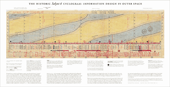
It is a masterpiece in visualization. So much information- multi dimensional information, all packed so nicely and presented on a piece of paper where one can choose to get the "bigger" picture at a glance or navigate through the details. Complete view, layers of informations, all connected through various dimensions of time and events, again in a mere 2-D paper!! Almost in the same spirit as Hans Rosling did with animated (3D) statistics in the TED video we saw in the class, or perhaps what Google is doing with Google stories.
Collage

Okay. This is my first (and maybe last) collage.
Actually, I don't know the rules here. Should the idea be
hidden or be obvious? Should it have several "lines"?
Can I use photos made by me? (Actually I used one. Guess which one).
Interactive Tourism Application
Last week I wrote a long post about the reading, this week I decided to focus my post on our project. For my project I was originally planning on doing an interactive tourism environment that was almost game like. Then a few days ago, I read an article (the link is below) about Apple’s plan for their new tablet. It made me consider a few good points about creating the project. There is no need to reinvent the wheel. Use resources that are available to you.
You should be filling a void in the market. I discovered through research there were environments that did exactly what I intended to do already available. Additionally, I discovered that Facebook doesn’t have any really good travel applications. The best one available is Going Places, which only has a few hundred users (less then 200 active users). Thus, creating an interactive travel application for Facebook would fill the void in the marketplace.
Products can have multiple uses. These uses can be from educational to fun. I realized that what I create should be interactive and fun while still having some educational value. Having a product with multiple uses will expand the market of people who would be interested in the product.
http://online.wsj.com/article/SB10001424052748703405704575015362653644260.html?mod=dist_smartbrief
Mark Tansey

I thought it would be good to include another Mark Tansey painting. This one is a favorite of mine, called The Innocent Eye Test. This is another painting in which Tansey comments on art in a rather absurd way.
Comfort Women
This post is in response to Jeremiah's collage and his last post. Also, this relates somewhat to Francesca's project.
I'm not sure if anyone is familiar with Comfort Women. During the Japanese occupation of Korea, young women were forced to perform sexual services on Japanese military in "comfort stations." Skip to today: The surviving women have recently started speaking out after 50+ years. They are demanding an apology from the Japanese government. Japan refuses to acknowledge any wrong doing. I lived in Korea for 2.5 years and every Wednesday the survivors and other supporters would peacefully demonstrate outside of the Japanese Embassy. They vowed to be there every week until the Prime Minister issued a formal apology.
Amnesty International supports the cause and last year created an interactive website where people could also show their support. Donations were accepted as well, but mainly it was just to show support. People were directed to a program that allowed you to create your own butterfly for the Comfort Women. (Here is the website) You chose the style, color and also controlled the swirl pattern using your mouse. After, people were asked to set the butterflies as their facebook or myspace...etc. profile picture. This was the butterfly I made last year. This article talks about the outcome of the project.

Jeremiah - Collage

So, I've been working with images for a while, but I actually have never put together a collage, nor do I posses any great photoshop skills as I strive to show my work as honestly as possible.
For me, this represents a few of the problems when it comes to dealing with poverty issues, primarily how the more well-off people usually get their way while the poor have no voice and must make do by whatever means necessary for survival.
It's certainly a more literal interpretation of the idea, but I think it gets across.
Also, I'm really struggling to find a way to relate my project how I view it. Especially when it comes to what type of medium I'm going to use. If anyone has any ideas or opinions, I'd love to hear them.
Loads of Media
Here's a link to a very good look at how much media there is covering the same events and if resources from major news organizations would be better served if they pooled together.
As a photojournalist, I agree with this in terms of bettering communication and sharing stories/images between news organizations. But, all storytellers tell stories through their eyes and that's what makes a story personal and powerful. If certain photographers are delegated to only cover certain areas/stories, then the differing views will be missing. We'll (the public) lose the ability to see and decide for ourselves what we think of any given situation.
Overall though, I'm glad people are asking questions and trying to find a better way to cover stories.
Collage Project

I made two collages for the class assignment. As you know, my project will hopefully be creating a website to input your shopping list into and have a route map generated for you. That is what is on my mind right now, so my collage is centered around the problem I am looking to solve. This is how I feel while grocery shopping: running around, scrambling to finish and get on with my life. I made this with GIMP (which took me forever to figure out (Thank you Arturo.)). I have never used Photoshop, so the less user-friendly interface of the free version really took me a long time. I particularly had a hard time cutting out the rabbit from the original white border. (The fuzzy tool is awesome!) As you can see in the top collage, I wasn't able to cut out the white part between the arm and the chain, but I figured it out in the second one. I also motioned blurred the rabbits in the background to hopefully give the effect of him running down the aisle, and I replaced his clock with a Dali-inspired one. The first collage is what it looks like when I shop. This next one...is what is happening in my head when I shop.

Offsetting the aisle, rotating it, and changing the scale took forever but I love the look of it. And this time instead of replacing the rabbit's clock, I warped it.
Sunday, January 24, 2010
Poetry parallels and clutter: 3 Formats


The three texts are actually one and the same, it's Charles Baudelaire's (1821-1867) poem called CHATIMENT DE L'ORGUEIL in SPLEEN ET IDEAL, his famous poems collection. The visual parallelism evoked by Edward Tufte made me think about how, though we take it for granted, poetry aligning in formatting is important. Not only from left to right, but even more from right to left (flushed right) because then we can visualize the end of lines rhyming, and those are the core points that make the music of poetry audible without sound, just by visualization. How about if you were given the choice to read in public a text of similar poetry in one of those three formats, which one would you not chose for sure?
I think also visualization becomes as important to the presenter (the actual giver of inofrmation) as to the audience (the receivers of information).
Boat accident on state highway: A Collage

This is an experimental collage I created while learning Photoshop. I am amazed at the features phtotoshop provides! It is close to magical work! I really like one particular tool- which is aptly named "magic wand". You can click on certain area of a picture and this wand makes a very good guess of what portion of the image you want to select. I cannot help but wonder what kind of graphic processing/pixel matching algorithm allows such a feat!
Oh and in case you are wondering, yes the collage is a crime scene investigation. An over speeding boat which ran over a pig on the state highway to heaven!
Friday, January 22, 2010
Autodesk- Free Student Softwares

Hi guys I found this website, Autodesk, where you can download 3d softwares such as 3ds Max and more for free. Of course it is only for student. I think it gives you like a 6 month license.
Illusions in virtual reality
While reading Tufte I remembered a documentary I saw sometime back on brain research using virtual reality. Posting two links:
http://scienceblogs.com/notrocketscience/2009/07/virtual_reality_illusions_produce_out-of-body_experiences_in.php
http://news.bbc.co.uk/2/hi/health/6960612.stm
It is really interesting how a person was fooled in believing that his body was located somewhere else. How we feel that our "self" is located "behind" the eyes- like a first person shooter mode in a computer game :)
Change the camera position and the brain can be fooled about the location of the body. I would surely like to play a computer game where I am really "in" the game!


Haiti in 360
I saw this video on cnn. It's a 360 degree camera driving
through the streets of Haiti and the person can actually move the
camera around and view any direction he/she wants.
This type of vantage point gives a totally different view than still
life photos. Thought the rest of the class would find it interesting.
Thursday, January 21, 2010
information anxiety
Hey everyone! Below is a rough write-up of my idea. I would really like some feedback on what you guys like/don't like about the idea and any questions. Thanks so much.
We are constantly bombarded with information. We are suffering from image anxiety. I check twitter too much. What if their was a way to gauge how active twitter was by looking at a visualization?
Using the data from twitter I want to make spontaneous generated murals. Murals are already somewhat immersive because of the relation of size to a human. This mural would change every time someone tweeted and also change due to topics that are currently trending. That way you wouldn't have to look at twitter to know that a new topic has broken.
I want to use my aesthetic in the art piece I create. I am interested in nondigital art as well as digital (including painting, drawing, & printmaking) so I would like to create interactive pieces that still have that artistic sensibility. I am interested in mark-making that still looks handdrawn or painterly. A lot of my pieces have texture and visual movement so I would like to try to translate that to the immersive environment. Patterns created could also be exported and used as digital design elements, printed artwork, or textile design.
Wednesday, January 20, 2010
Outside the Box

One important thing to remember is that visualization needs not be constrained to the screen but can be a site specific or physical manifestation of something otherwise invisible. One perfect example with which I am sure everyone is familiar with from school is to visualize magnetic fields by placing a magnet under a piece of paper or cardboard covered with iron fillings. But in how many other ways can you extend that concept to show it in different dimensions?
One way is to use ferrofluids which are suspensions of fine iron particles like magnetite or hematite in some carrier liquid medium. Playing with ferrofluids and some powerful magnets can keep you mesmerized for hours. The resultant forms are not only beautiful to watch but they visually depict the magnetic fields in all their glory!

Syntboutique, Installation, Singapore 2008
Another example is a site specific installations or objects like the ones depicted in syntfarm . I see how the Syntboutique installation for example could trigger ideas for the food or smell related projects that we have been talking about in class.
Information Tsunami

Five Years of Infosthetics
He made a custom adaptation of his own elastic lists concept to organize the thousands of articles that Infosthetics has generated in the past 5-6 years. Here it is. You can filter it by your subject or category of interest and explore it until you are about to suffer an information attack!. Great site.
Tuesday, January 19, 2010
 Hi Everyone. First I would like to thank everyone for their warm wishes, their concerns and their help for the situation going on in Haiti. It's still unbelievable and I would love to have a time machine to go back to 1/12/10 16:52 right before the earthquake as in the movie flashforward. I am trying to hang in there as for the few seconds I was able to talk to my mom she made me promise not to drop out. I did and I will try to do my best.
My project might change as a result of what I am been living and the chaos that people are experiencing. Help is there but there haven't successfully reach people because there is a lack of communication due to language (for instance it was difficult to rescue three people because the Panamean team and the Israelian team couldn't communicate and it was impossible to find a translator speaking spanish and Hebrew.) The same situation prevails for food, water and medical assistance. As coordination appear to be the key, I was thinking of using a Promethean board linked to a GPS that will allow real-time visualization of the dispatch of helping troops and supplies (pretty much as what is offered by gpsrts.ufl.edu). I was thinking of having flags (representing the troops helping) logos of materials they are having in green, these that are about to finish in yellow and supplies that are lacking in red. Such a board would be at the airports thus teams know where to reach. Paths of streets will be colored the same way to attract attention on region that has yet received any help.
I hope this make sense. I have no clue how to do this right now. I will be thinking about it.
Thanks again for all your warm thoughts.
Tons of Resources
I'm currently enrolled in the Interdisciplinary Research Seminar, but I thought I would share this link of resources I recently stumbled upon. Hope you guys can make use of it for ideas and inspiration!
http://nicolasrapp.com/?p=655
http://nicolasrapp.com/?p=655
OPEN PROCESSING
This site is great for sharing and finding ideas.
http://www.openprocessing.org/http://www.openprocessing.org/visuals/?visualID=2615
Monday, January 18, 2010
Walter Benjamin and the Aura
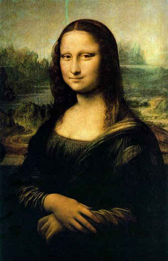
Arturo this is in response to your Optical Vermeer post (which was in response to Francesca's Camera Obscura post). I have read Benjamins "Art in the Age of Mechanical Reproduction" and for the most part I agree with him. The root of art in ritual gives credence to an "original" object that has been labored over for many hundreds of hours. Benjamin posits that reproduction diminishes the authority of the orginal (part II paragraph 3 last sentence), however I believe that reproduction may actually augment the aura of the original and brings art closer back to ritual. The Mona Lisa is perhaps the most recognizable work of art on the planet. It is a portrait of a rich mans wife from 100s of years ago, yet people flock to it from across the globe. If it were not for the unlimited proliferation of prints, photographs, postcards etc... would the Mona Lisa need to be housed in a bullet proof pressure controlled chamber?
HTML5 canvas element
Arturo asked me to implement a simple program that can draw a Mandelbrot set. The first idea was to implement it using the good old way - java, yet there is nothing "innovative" for me. Working with 2D graphics in Java is a really simple task. Then I thought that may be Processing is a way to go. Nah. Processing is just a simplified java syntax. Finally I decided to reimplement it (I actually found an implementation in the internet of a simple draw algorithm in "C") using JavaScript and a new HTML5's element canvas. I had never used this element before, and I was surprised how easily it can be used. So here it is. After you press "draw" button, it will take about 1 minute to draw a Mandelbrot set inside the rectangle area (you should use a HTML5 compliant browser like Firefox or Opera).
You can check the source code here.
So, actually to do a 2D graphics, all you need is a browser! No compilers or IDEs. Just a browser!.
The "canvas" element is a new feature of an HTML standard that allows to draw a 2D graphics using just JavaScript. Another interesting feature of the standard is a "video" element that allows to include video content on any HTML page without using external players like Flash or Silverlight.
Isn't it amazing?
Not the Tools
For the last four years of my life, I've studied almost every aspect and angle of storytelling, especially using visual and audible mediums. Even my writing (which I've never saw myself as a talented writer) has been critiqued and honed to a point where I feel comfortable writing for almost any kind of audience.
Storytellers will forever be needed, but in the age of on-demand, as-it-happens storytelling, it requires a different set of skills than used in the past. Long-range storytellers (which I consider myself a part of) is becomming far less in demand and a new breed of very fast, efficient storytellers are taking their place, capable to pump out more than a few stories every day. The problem here is that in-depth stories, our way of seeing beneath the surface, is becoming far less common and poses some serious threats to our complete understanding of our world.
As I've mentioned a few times in class, my goal is to use powerful storytelling to show and help fight poverty and injustices in the world. Haiti has always been a country in need of serious help on every single level, especially recently with the powerful earthquakes that shook the nation last week. One of the best visual journalists in the world, Dominic Nahr, was on the front lines and some of his work can be found here.
The amazing thing about storytellers such as Dominic, is the power of the truthfulness of the stories they tell. When the moment they show is so human, that even if one knows nothing of visual art, one can still relate and feel the power of humanity, which I believe to be the real art in storytelling. Everything we use to tell stories is just a tool: a computer, progam, camera, lens, microphone; they're all just tools we use to do what we do, tell stories. In the same way a painter doesn't love his paint brush, but rather he loves his own creation, I don't love the camera, but rather the story I tell.
The Art of Storytelling: “The truth never stands in the way of a good story.”
Storytelling itself is an ancient art. It’s a way we as humans communicate. It can help us understand/learn, see a different perspective, and give us pleasure amongst many other outcomes. Stories aren’t always truthful as was presented in this week’s reading on Explaining Magic from Tufte’s Visual Explanations. Tufte quotes Jan Harold Brunvand whom suggests “the truth never stands in the way of a good story.”
This idea in storytelling can also be exemplified in the stories young children tell. Children tend to have active imaginations where they invent stories, which they usually can’t wait to tell their parents and anyone else who would listen. At the same time as children are coming up with these fantastical stories they are often discouraged from telling lies and making up stories. Children learn quickly that lying and making up stories is highly frowned upon in our society. Imaginations are replaced by the reality of truths, which tends to not be as happy or exciting
The desire to embellish stories seems to make sense because reality tends to be unattractive while the prospect of an alternative reality can bring excitement. It should be obvious that storytelling does not require complete honesty. However, honesty is considered to be a virtue included in our daily lives. Some types of storytelling it is unethical to be untruthful. Although, some companies use misinformation in design to further their goals without regard to ethics (i.e. cigarette warnings). These fictions/lies/misinformation is driven by a desire to urge you to do or feel something.
According to McKee (2003), “Good storytelling displays the struggle between expectation and reality in all its nastiness. The great irony of existence is that what makes life worth living does not come from the rosy side. We would all rather be lotus eaters, but life does not allow it. The energy to live comes from the dark side. It comes from everything that makes us suffer. As we struggle against these negative powers, we’re forced to live more deeply.”
As a storyteller, you must flawlessly weave together a lot of information. The idea is to arouse the listener’s emotions and energy. The best kind of story is one that is compelling (McKee 2003). A little bit of truth is necessary to make a story believable while giving those experiencing the tale an opportunity to form meaningful connections. Thus, the best fictions will always have some sort of (underlying or universal) truth. This idea of some truth being in fiction is supported by American author, Stephen King, who said, “fiction is the truth inside the lie.”
Jung (1916, 1959) suggests that there are certain archetypal forces represented in the stories we tell influencing all humans. Woodside and Megehee (2010) created the below table of the different archetypes. (For a better )
 In conclusion, the important take away is to remember we are all storytellers who have a choice and control in the way we tell our stories.
The Optical Vermeer

Johannes Vermeer, Art of Painting, c.1666-67
canvas, Kunsthistorisches Museum, Vienna
Vermeer is without doubt my favorite painter, having seen a very complete exhibition of most of his known paintings in Amsterdam, I can, without embarrassment, say that I had tears streaming down my eyes, caused by the enormous "aura" of his work. I mention aura as in Walter Benjamin seminal work The Work of Art in the Age of Mechanical Reproduction which you can (and should) read HERE.
I was not the only one, the exhibition was very crowded and many people had the same reaction as myself. One thing is to see (mechanical) reproductions of his, or any other artist's work, and another to be in the presence of the actual piece that contains in its very manufacturing and creation a substantial part of a genius life embedded in its pigment particles and jewel-like crystallized varnish, not to mention the time captured by the object itself.
If it is true that according to Benjamin, mechanical reproduction "frees" the work of art from place and ritual so that the masses could then benefit from its formal appearance, yet there is inevitably a great deal of loss for the viewer that does not have access to the original. There is a trade off here.
But this is about Vermeer's famous mastery of light and extraordinary quality of detail, that, when observed up close, reveal abstract patterns and dabs of paint that we would not, in isolation, consider realistic. However when seen in context, our modern eyes, cannot fail to see a modernity and exactitude of vision which would be hard to explain without the possibility that he used a camera obscura as an aid tool in deconstructing the elements of the scene.
Now, I know many artists that cringe at the idea that such a Master might have used such a trick. But ever since the discovery of perspective, everything we see is in fact aided by that "trick"without which we have a hard time making sense of space nowadays.
There are many studies however, that have carefully analysed his paintings according to optical laws and using actual reproductions of a camera obscura and sets replicating the conditions that Vermeer might have encountered in his paintings and from this studies one could conclude that Vermeer, might have indeed, like many of his contemporaries, used it as a compositional aid.

He of course, and this is clear in other careful analysis as well, used a variety of methods to achieve what he wanted, sometimes pinning strings to the wall and using them as a reference point, similar as the Dürer engraving of the early grid assisted perspective shows.
What is a question perhaps, is to think whether the use of the camera obscura influenced his artistic vision by showing optical artifacts that are not commonly perceived by the naked eye, such as glows around shiny objects, "circles of confusion", blurs and exaggerated scales in some cases.
Sunday, January 17, 2010
4 Shades sheet music

I loved the principle of Edward Tufte we've been reading about this week in terms of reducing visual clutter by minimizing the contrasts.
So I tried it and came up with those 4 shades of music lines. This also answered my question why I prefer to buy certain copybooks rather than others, even though the ones I like would have less sheets, be smaller, and perhaps have less ink involved in their actual lines draft... So it's all about the visual "aisance" or comfort. Lighter contrasts create more discretion to give more room for creativity. So that the more focus would be on the actual content rather than the outline (too bold, too intimidating). Even though, for educational purposes, when children learn to write music, I believe it is better to give them bold lines. As beginners, their task is not yet creativity as much as crafting, counting beats, and identifying sounds, etc.
Here are the 4 forms. It took me a huge amount of time to configure this and present it here technically. But WOW I did it! Youpee!
Now if you ask any of your musicians friends which of these shades they prefer or would choose when buying a copybook? I can't anticipate the answer, but this would be another subject study and actually one should survey several composers to form an opinion.
The Hockney-Falco Thesis

Any discussion of theories of perspective is not complete without discussing the Hockney-Falco thesis. The thesis was developed by the painter David Hockney and the physicist Charles M. Falco.
from wikipedia:
As described in Secret Knowledge, in January 1999 during a visit to the National Gallery, London Hockney conceived of the idea that optical aids were the key factor in the development of artistic realism. He was struck by the accuracy of portraits by Jean Auguste Dominique Ingres, and became convinced that Ingres had used a camera lucida or similar device. From there, Hockney began looking for signs of the use of optical aids in earlier paintings, creating what he called the Great Wall in his studio by organizing images of great realistic art by time period. What he saw as a sudden rise of realism around 1420, combined with Charles Falco's suggestion that concave mirrors could have been used in that period to project images, was the germ of the Hockney–Falco thesis.
Another Look at Sustainability
Sustainability is a topic I've recently taken interest in and would like to reiterate the importance it has for the designer. I recently watched a short video for another class of mine that covers environmental and social issues related to production and consumption. It does a very good job of presenting a complicated subject through simple visuals and interactive icons that are easily understandable. The link: http://storyofstuff.com/
Friday, January 15, 2010
The Power of Numbers

Fractal generated landscape
Last class we mentioned the example of Benoit Mandelbrot, the father of Fractal Geometry. His work is so important and has influenced so many fields, from mathematics to medicine to entertainment and economics that I am not even attempting to go into more details.
I leave it up to you to find out by utilizing available resources in the net or in the literature, like Mandelbrot's own book The Fractal Geometry of Nature, which made possible to non-specialists to understand or simply enjoy how the visualization of a simple recursive formula can reveal the underlying structure of the world around us, I would even say of the Universe itself.
After people in the film industry for example, were able to "see" with their own eyes the generative power of this recursive formulas, computer graphics programs were developed to take advantage of this procedure to generate highly realistic natural phenomena, from landscapes to water, explosions, fire and such. Things would never be the same.

On a similar note (pun intended), Stephen Wolfram, has contributed to the visualization field, as well as many others too numerous:-) to mention here. Among other things he is the creator of Mathematica, a computational software used primarily for scientific and engineering visualizations. Thanks to that program many applications have been developed that relate to the arts as well. The case in point is Wolfram Tones, which allows you to generate music, soundtracks etc. where you can modify parameters (such as type of sound, rhythm etc) to suit your taste or your application, try it out. You could call it Audiolizations!
Thursday, January 14, 2010
Help is in our hands

From the book: Solidarity Will Transform the World by Jeffrey Korgen
There are some points in life when every other thing is secondary. This is one of those moments, when millions of people are terrified and with a very grim future ahead.
We are all connected. Our group is like a family, we will work together for months, in some cases we will make friends forever. Our fellow student, Christine Irvika, is from Haiti, let's hope that her family is well and let's keep her in our thoughts. She is part of this family.

FOODS:
- Can Kidney beans
- Can sausages - Can Sardines - Can Tuna - Saltine crackers
- non-perishable Milk - Fruit juices in non-perishable containers - Nonperishable Foods.
MEDICINES
- Oral rehydration serum - Gauzes - Cotton - Analgesic (acetaminophen, ibuprophen) - - Elastic Bandages - Antitetanic Toxoide - Human antitetanic Ganmaglobulina - Antibiotic (amoxicifilina, in suspension and/or tablets) - Antiseptic (type yodopovidona, or type soap of clorhexidina) - sanitary Towels
Please send no clothing
You can send your contributions to the following addresses:
- Bonó, c. Josefa Brea N. 65, Mejoramiento Social, Santo Domingo.
Tel.: 809-682-4448. sjrmbono@sjrdom.org
(You need to activate Javascript to see this web.)
www.bono.org.do
In two days more than 4.5 million dollars have been texted to aid in this disaster. We can help right from where we are.

Call 90999 on your cell phone and text "HAITI." You will be charged $10.00 on your phone bill, the money of which will go to the Red Cross.
If you want to send goods instead, this is one suggestion, since it goes directly to the closest point of contact (their neighbors in Santo Domingo), "official aid" always takes too much time at a time when hours make a difference:
The Centers of the Company of Jesus in Dominican Rep. (Santo Domingo: Bono and Alberto Hurtado Center; Santiago: Center Bellarmino and CEFASA; Dajabón: Border solidarity) has established an aid network to help the victims of the earthquake in Haiti. They are accepting the following :
FOODS:
- Can Kidney beans
- Can sausages - Can Sardines - Can Tuna - Saltine crackers
- non-perishable Milk - Fruit juices in non-perishable containers - Nonperishable Foods.
MEDICINES
- Oral rehydration serum - Gauzes - Cotton - Analgesic (acetaminophen, ibuprophen) - - Elastic Bandages - Antitetanic Toxoide - Human antitetanic Ganmaglobulina - Antibiotic (amoxicifilina, in suspension and/or tablets) - Antiseptic (type yodopovidona, or type soap of clorhexidina) - sanitary Towels
Please send no clothing
You can send your contributions to the following addresses:
- Bonó, c. Josefa Brea N. 65, Mejoramiento Social, Santo Domingo.
Tel.: 809-682-4448. sjrmbono@sjrdom.org
(You need to activate Javascript to see this web.)
www.bono.org.do
or
My very first Zoog
 Thank you, Arturo. Putting it in photoshop helped. I also did an animation, I will be uploading it soon.
Learning Processing
I have been reading the Learning Processing book, and I was impressed of how well it explains processing. I never thought I could ever make a drawing through programming, but thanks to this book I was able to create my first Zoog. I would like to share it with you guys, but I don't know how to upload it. Any suggestions?
Tuesday, January 12, 2010
M.C. Escher
Earlier today when we were talking about perspective upside down on the table and in the readings, especially with Roy Lichtenstein and the artist on the ladder, I naturally thought of Escher. He is, undoubtedly, the first artist I ever took note of. Waterfall was the first drawing I ever saw and it still holds the same "awesomeness" as it did when I was 11 and I didn't understand a whole lot about perspective and illusion.

If you are not familiar with his work and the other works that were inspired by his, I highly recommend taking a look. Here are some videos and pics I think are worth taking a look at.
Shigeo Fukuda has an interesting collection of sculptures recreating Escher's works, such as Waterfall. There are also several Lego sculptures (these, too) dealing with the same ideas of it.
What's even more exciting is how with all the advancement in technology, we are able to experience Escher's works through new mediums, for example, digital design and animation.
That's what is so great about design...you don't have to "recreate the wheel." Just slap some new rims on it.
Life 2.0 Comments?
Hello Everyone. I am Ashutosh and in the class of Digital Design and Visualization. I am doing my masters here in computer engineering. And hence I, quite possibly have formed a lot of my "notions/views/biases" by looking through the glass of an engineer- more often than I probably realize. Digital design and visualization is the first course that I am taking outside the computer engineering department. I hope to become some sort imagineer rather than just an engineer in future! :)
I still have no idea what project I can/must/should do for the course. And been looking in my head and in the world wide web, hoping to find some inspiring thought that I can make as a project work! :) But nothing. Here's some cluttered thoughts, sort of ranting or maybe towards that illusive idea. Feel free to help me out :)
..I have always been fascinated by works which transcends the medium in which it is manifested. Perspective view in paintings did it for everyone by having illusion of depth in a piece of paper. Cubists took it further by adding more than one view points.
When I was a kid, I read a comic book on GI Joe (don't remember the name of the book). What I found really interesting in that book was at the end of every chapter it gave the option of choosing which chapter to read next depending on which direction I wanted the plot to progress. That was my first exposure to interactive story telling, although at that time I didn't know what it was called. Content was very mediocre(!) , however I liked the non-linearity; extending beyond the limitations of books with papers bundled together in a particular sequence as deemed appropriated by the writer. Chris Marker did La Jetee (http://en.wikipedia.org/wiki/La_Jetée); an awesome science fiction movie with just photographs that I somehow remembered just now. But I am talking way way back in time and technology :)
With the advent of digital media, not only the medium has become very rich in itself- giving artists a whole new bag of tricks, it promises new boundaries of the medium to be broken. I am thinking what should immersive virtual reality do to go beyond the medium...I am reminded of Nietzsche (who was one of the early adopter of type-writers!). He said, "Our writing utensils collaborate in producing our thoughts". And with immersive virtual reality, computer graphics, etc., the "writing utensils" has become vastly potent than a piece of paper and a type writer.
John Maeda, professor from Media Lab at MIT believes the distinction between digital artist and (non-digital?) artist is no longer necessary. He says that internet, computer graphics, digital video has become so pervasive that the term "digital artist" is loosing its meaning. "Computer technologies are at all levels and scales in our civilization," Maeda said. "Everything is digital -- copy machines, hair dryers, microwave ovens -- but we don't refer to them as 'digital.' Why should we bother to refer to digital art?"
Just read about the film "Life 2.0" (life2movie.com), directed by Jason Spingarn-Koff, which has just been accepted into the 2010 Sundance Film Festival, and is a feature length documentary about the impact that the virtual community Second Life has had on the world. Anybody has any comment on it?
Monday, January 11, 2010
Welcome Anmar Matawi and Azza Altabash

Two faculty members of the King Abdulaziz University (KAU) from Saudi Arabia will visit us tomorrow and will sit in our class. They are part of a group hosted by
 As you can clearly visualize
What is Information visualization?
 I will not be answering that question in this post.
 Instead I am more interested in the phenomenon of information. It has been said that in the last couple decades we (humans) have produced exponentially more information than we have ever produced in all of history(due in large part to accelerating computing technologies).
Jean Baudrillard in one of his papers laments this as the saddest thing to ever happen to modern man, our information obsession in which we must generate and categorize information about everything but NO MEANING is ever produced.
He gives the example of a recent airplane crash in which recovery teams collected the majority of debris of the wreck and pieced the plane back together in attempt to discover why the plane went down, We gain no meaning, no solace from this activity, the deaths of the individuals on board still remain pointless and tragic, the human condition is still one of suffering, we have only garnered more information to be analyzed and continue its ad nauseum profusion. SO the question than is how do we construct MEANING? How do we use our abilities of visualization and expression to make sense of it all?


Sunday, January 10, 2010
Blogging and Interactive Technology
The last several years I have heard the benefits of blogging. I understand it allows everyone to be a ‘journalist.’ Blogs allow people to tell stories and disperse information with just a few stokes of the keys and a few clicks. The problem with this is there are no ethical guidelines nor a system in place to check facts. There have been some guidelines proposed, but you can’t get the entire world on the Web into agreement and compliance. As someone who has written for traditional media and a Webzine, I strongly value the journalism system of writers and editors.
Through the years I have been given various reasons why I should start blogging. That everyone was doing it now never was enough for me to start blogging. When I believed it might be beneficial professionally, I strongly considered it. The idea that there are lots of people who actually care what I write seems a little arrogant to me since there are billions of other people in the world. There are some positive aspects of blogging that I recognize. The use of a blog as a way to interactively exchange information (much like a forum) is definitely a positive of a blog. The use of a blog as a place to gather your opinions and thoughts is an good enough idea. Although, I still don’t understand why a person doesn’t use a private journal to express their thoughts. I’m starting to blog for my graduate visualization class.
Even though, I am apprehensive about blogging I am interested to see how it works as a informal/semi-formal means of class discussion. Now, back to the idea of visualization. We live in a world filled with visuals, which we assess in order to get a sense of scale, size, number, and amount as stated in this week’s reading. It is interesting how we use frames of reference for making judgements on quantity.
This is interesting article I found about a projector that can make visuals interactive on a variety of surfaces: Interactive Projector
Transparency and Sustainability

Image Source:http://graphico.free.fr/hfr/pollution.jpg
Leonardo Bonnani who teaches Future Craft: Radical Sustainability in Product Design at MIT Media Lab has created Sourcemap, an open source project that is a model of transformative Design.

Where do things come from and what are they made of?
Subscribe to:
Posts (Atom)