I attended the Future of Digital Studies Conference at Digital Worlds on Saturday. Speakers included Lev Manovich and Janet H. Murray. These things depend on interaction and accessibility. I feel like the immersive environment of the screen is not being used creatively enough. The format of a conference like this is no more inventive than the video conferences of the 90s. Why not have more creative visualizations? Why not have users or conference attendants submit a few questions or statements electronically beforehand?
The conference itself had some technical issues. But I was more struck by how abstract all of the thinking and statements were. These theorists seemed more afraid of the implications of technology than really even wanting to understand it. I was wondering if they could benefit from some more solid grounding on how computers work.
Sunday, February 28, 2010
Wednesday, February 24, 2010
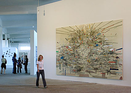
The Question of Art

Aaron, with Decorative Panel, 1992
"AARON would always need to know what it was doing, and the key to what it would be able to do would always be constrained by the ways it would represent, internally, what it had already done. "
For those of you unfamiliar with the work of AARON, let me first show you some examples of the work, and ask yourself this often asked question: but is it ART?

Meeting on Gauguin's Beach, 1988

Liberty and Friends, 1985

Theo, 1992

(Detail) One of the Young Ladies Grew Up ans Moved to Washington. 1980
Tuesday, February 23, 2010
visualization tool - need feedback
Hi everyone!
After today's class I realize that I might need more feedback from others to complete my short paper and to tweak my project. Since I am actually creating a tool, I want to know what you guys see as problems with image editing programs. Are the options in them too varied? Does the machine ultimately have too much control of your image? Are you an author or a co-author?
I have a problem with how image editing programs work. Most of them seem to revolve around editing photos, not creating new works of art. While, I use Photoshop to present and "clean up" finished drawings, I rarely use it as a tool for creating compositions. Does anyone else have this problem? It does not really serve me as an artist. It seems like you have to adapt to them, rather than they suit your needs. I am creating a program/software/application that can organize and reconfigure my own artwork, sort of like a new collage tool. Simplicity is key for me. I want to create new work from my own sketches.
I want it to be more intuitive and easy to use, Perhaps one day another artist would want to work this way with their own artwork. Or, I could easily collaborate with other artists by combining my artwork with theirs. What would you like to be able to do?


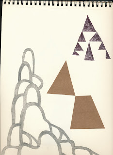
Color Bounce

I am making a kaleidoscope out of reflective, translucent, and colorful surfaces. After experimenting with reflection (previous post), I wanted to manipulate the color, so i made various sketch models. Only one of the surfaces has color, the rest is actually its reflection mixing with other colors.
Monday, February 22, 2010
Another post: project update
Lately I have been furiously working on my projects :) and have not been posting a lot so here in this post I will bring you all up to speed on my project status.
Originally I set myself the task of finding ways to augment the quality of interpersonal communications through technological means. One idea I had was that it is empathy and your ability to get others to empathize with you that creates powerful and effective communication. Some of the methods I had propsoed in class to acheive this goal involved possibly projecting images and colors onto or behind a user that would be reactive to the users communications, or to possibly have appropriate tones and sounds play through a user triggering a device with the fingers. Ultimately I settled on a project that would focus solely on negative emotional states such as discomfort or anger.
The goal is to create a device that will measure users negative emotional states and project these feelings into others in the immediate vicinity. Effectively the enhanced individuals emotional state influences that of the groups. Here is a pic of the device and circuit in progress:

To do this I have hacked a biofeedback sensor to read skin galvinity and heart rate, both being indicators of distress. I utilized a Darlington pair for the transistors to amplify the signal. I have hooked the device to an arduino microcontoller that will then trigger an ultrasonic emitter that I have but need to assemble still. (It has been shown that when ultrasonic beams are projected at people that they experience sensations of discomfort. )
Once i get the sensors and the ultrasonic emitter working properly I will than build the device into a sculptural wearable that I have drawings of but not machetes yet. So my next steps in order are to 1) get ultrasonic opertational 2) build machetes 3) embed device into a wearable sculpture.
FOODTRACER
Adding to the culinary thread started below this is a project which is very related to what we have been talking about in class. Take a look:
Food Information Transparency from gusepo on Vimeo.
Freebase
Since many of you are using or want to use data let's take a look at FREEBASE, which is a special breed of data aggregator, wiki, social network etc. The data is being generated by the users, as is usually the case, and can be utilized by you in a variety of ways, the simplest being to link to it of course. Others can add to your theme or subject etc. By creating your own Freebase you are adding your experience or knowledge about the subject to a bigger comprehensive pool. Of course the internet itself is like that, but these pools are the equivalent of specialized areas of the brain that are more focused on certain subjects, skills or concepts.
For example, I started one as a test called Interactive Storytelling which you would find as a top domain if you searched for those keywords in the Freebase link. I have not used it much at all, but I just noticed that some people actually added related themes to it.
So I suggest you all type some keywords in there and see what other related stuff you find that is of interest to your project. I am sure you will be surprised.

Social Networking for People who Cook
I heard about this Web site and thought of our class. It's called Tasty Planner. It's a social network for cooking that also compiles grocery lists among other features.
Catching up
I realized that maybe I have been slacking in blog posts lately so I will to do two posts to catch up. First in this one I have finished pictures of my collages that I showed you all the third week when Arturo asked for them, I realized though I never got the finished pics on the blog so here
they are:

This first collage I showed you all was inspired from the visual explanations text. Its just a simple juxtaposistion of a serendipitous relationship in shape and form. I had these bronze bird skulls that I had made recently that i knew I wanted to use. I flipped open an old childrens book and found an image of an icecream cone that was exactly the same shape and outline of the skull. I liked the relationship of the two, of differently similar, so i decided to constrain them here in this collage.
 This second collage has been become a visual factotum for the overall thesis of my work here at digital worlds, and that, in the broadest sense, is the question of can we use technology to augment empathy? The tableaux mimics the chakra system while paralleling Maslow's
Hierarchy of needs, linearly up the center, while forwarning of ego or desire driven augmentation around the sides of the image.
It is my fear that as we begin to augment our mental and physcial bodies through technological enhancements that we will forget to augment our very souls. The powerful consumers of the world will be able to even more effortless exploit the worlds poor through their enhanced state of beings.
I worry that as we merge with machines that our empathy and human spirit will wither if we do not actively seek ways to incorporate the incorporeal into technological systems.
That is my purpose of these projects I am working on, to actively seek solutions to this problem.
GroceryPS
So, I'm having some difficulties getting my hands on an inventory list for Publix. I've contacting Publix and I'm still waiting to hear back. I've also contacted AggData, Screen Scrapper, and other data websites and all of them have said they have no such list. I'm holding out for Publix to give the info. I did go ahead and finish up my site map.

What should I do?
I like the NING idea but not sure which category to use? (Network, Music) For the Wiki I don't know how it works? Do you actually control, for example, from users comments, what you keep, and what you delete?
I am a little discouraged seeing all hymns websites I visited, having everything, I feel like I don't have much to add in the field...
I want to do something kind of innovative, kind of unique...
I'm wondering if I should not go back to my translation project idea... ???
I am a little discouraged seeing all hymns websites I visited, having everything, I feel like I don't have much to add in the field...
I want to do something kind of innovative, kind of unique...
I'm wondering if I should not go back to my translation project idea... ???
 This is a small concept I've been playing with to visualize the sun path through days and seasons related to the coordinates of a given structure. This could be incorporated with local weather to predict power availability for passively heated homes. I may end up scrapping this thought, as I focus on visualizing sustainability and eco footprints of building materials/products
Sunday, February 21, 2010
Visualizing social network
Complexity! While reading this article, it was interesting to see that the same way the methods of reproducing the networking have been evolving, the representation are becoming more complex! In my opinion the relationship might be a two-way process. Either while representing by hands a lot of details were left out that computer representation will point out or the more we are using the different network that are available the more the networks are becoming complex. It might be both actually.
It was also interesting to see that nowadays everything is considered as a network; for instance the nautical food web that we would have certainly previously called a food chain. Even our vocabulary is representing the addiction to networking.
It was also interesting to see that nowadays everything is considered as a network; for instance the nautical food web that we would have certainly previously called a food chain. Even our vocabulary is representing the addiction to networking.
Thursday, February 18, 2010
Tableau
I found this very useful site that provides you with a data visualization tool that graphs in a variety of formats and I believe you can come up with your own (in C++) for those of you who speak those OH TOO CLEAR languages:-)
All you need is to find a good set of data, for example from AGGDATA which I showed in class. Some of their datasets are free to experiment with (and make sense off).
All you need is to find a good set of data, for example from AGGDATA which I showed in class. Some of their datasets are free to experiment with (and make sense off).
Or just search for government databases, there are thousands on every imaginable subject and they are free.
The data can be in different formats, for example Excel spreadsheet, Microsoft Access or plain vanilla text file (like CSV) If you want more professional databases like Firebird, MySQL and such you do have to upgrade. But for playing around and understanding the power of these types of tool the freebies are more than enough)
This example is fully is interactive so you can see lots of relationships. (I decided to just link to it because it kept expiring since it is hosted by the Tableu service. It is also easier to understand and use that way)
Then check their how-to demo, download some formatted data and have fun.
Wednesday, February 17, 2010


Tuesday, February 16, 2010
sorry im like spamming our blog
I wanted to see if I could get Processing to analyze the color in my drawings and then make generative art of this information. This was WAY easier than I thought it would be. Another step closer. Next I want to make a program with a GUI so you can toggle between more than one image and blend them.
So I went from this:
To this:
And this:
To this:

So I went from this:

To this:

And this:

To this:

Facebook Travel Application

This is my first run at a homepage for my Facebook Application. Each image would be click-able and take you to a different component of the application. For example, the luggage would take you to a section on what to pack based on what other users brought with them. The paper cutout people would have information about different cultures including social norms, customs, laws, etc. The journal with pen icon would allow users to post their itineraries in advance plus blog about their experiences. The emergency sign would contain local emergency information (such as phone numbers e.g. 911 in the USA), information embassies (address, phone numbers, hours, etc.). The camera icon would take you to a place to post pictures that could be made into a personal photo album/scrapbook. The video camera icon takes you to a place to post video. The money icon takes you to a page with currency information also what things in the area customarily cost. This should help tourists from getting taken advantage of. The gps icon is going to provide maps of various areas. The meal icon will send you to a place with restaurant information sorted by location and food category. The sites (ruins) icon provides the different available attractions in an area separated into the following categories: cultural (museums, historic sites), parks, entertainment (live theatre, movie theaters, sports). Both the meal icon and the sites icon will have a place for users to rate cost of each restaurant and attraction. However, the sites page will allow users to provide how much time is needed for the attraction. This will allow users to be able to manage their time better. The map and plane icon will take you to a place for you to log places you have been, where you want to go, and where you have lived. I am still deciding what the exact functions of the passport/passport stamps icon.
I have included a home button and back button, which will make the application user-friendly and easily navigable. Also, there is a tutorial and help area where new users as well as users who may be unsure of how something works will be able to easily figure out solutions.
From research I did on other applications, privacy was an important consideration for users. The settings page will allow users to select who sees what information. They will be able to choose what type of notifications they get. Also, inviting friends to join will be optional to using the application. Although, I'm not sure if a person would have to be apart of the application to see the content their friends generate. The profile section will allow users to be able to network with people who have similar travel interests.
Please provide any comments or feedback you can on the Facebook event page. I am planning on putting this information on the event as well. I really appreciate as much feedback as possible. Thanks again to all those who have provided comments so far.
I'm going to try to come up with some more possible page layouts before next week's class. Hopefully, I should be recovered from my cold by then.
Does anyone know a good resource to learn what can be done with HTML 5? If anyone also knows of any good resources to learn how to code in HTML 5 let me know.
Visualizing Social Networks via Facebook
I wanted to elaborate on some ways Facebook can be used to visualize social networks since my project will use Facebook's social network to generate content from users. An application on Facebook called the friend wheel visualizes contentions you may have amongst friends that you might not have realized. As you can see this application uses multiple colors to visualize the connections. Others have created visualizations of their friendship networks as seen below.
 This visualization distinguishes the relationship we have with others into several categories. In figure 4 of Visualizing Social Networks by Freeman shows Moreno's visualization of friendship choices among fourth graders. Obviously, since 1934 the technology of data collection and storage has come a long way as Freeman mentions in section 6. The World Wide Web has in fact made creating and sharing visualizations of networks easier and faster. In terms of visualizing relationships, Facebook and other social networking sites have an advantage of using the profiles their users have generated to compile and visualize networks.
 As you can see this application uses multiple colors to visualize the connections. Others have created visualizations of their friendship networks as seen below.
 This visualization distinguishes the relationship we have with others into several categories. In figure 4 of Visualizing Social Networks by Freeman shows Moreno's visualization of friendship choices among fourth graders. Obviously, since 1934 the technology of data collection and storage has come a long way as Freeman mentions in section 6. The World Wide Web has in fact made creating and sharing visualizations of networks easier and faster. In terms of visualizing relationships, Facebook and other social networking sites have an advantage of using the profiles their users have generated to compile and visualize networks.
Project update

I am very excited to work on my visualization. I realize now that I desire to create my own software-like program. So far I have been using Processing and exploring how I can manipulate images within it as well as create interactivity. Below is a screen capture of my first experiment. Simple, but it is a start.

Monday, February 15, 2010
Broken Hearts

This was an article in the New York Times today about a traveling art exhibition featuring items used in break-ups or connected in some way. Some examples were a cell phone, a strand of cut hair, a vile of tears and even a bottle of champaign bought for a first anniversary that never happened. The bottle is still unpopped.
I thought it was an amazing use of imagery to capture such a strong emotion. And good timing too!
Modelling human using makehuman
There is a really cool software called makehuman ; as an open source free alternative to expensive software like poser.
It can help you create life like human figures, similar to mannequins, in about 10 minutes. It supports exporting in wavefront and collada formats.
And it is fairly intelligent in its implementation of UI. For example, adding body mass on 40 years old woman will be different than adding same amount of body mass on 40 years old man. It is very realistic, and did I say it is free :)
Making (non)sense of social data though visualization
Moreno's idea of sociagram- if at all a novel idea of that time, is an interesting way to understand relations and associations. However, it lacks weight or degree of intensity in nature of such associations. In the image of "Who Recognized Whom Among a Collection of Babies", or in network of friends, the strength of recognition and friendship is a vital element to understand the association properly. A crude way to improve it would be to add thicker, colored arrows to depict such detail.
On a side note, this fixation with dichotomy in "categorizing" world, I think is way too simplistic to warrant any thought, but this method has dominated our thought process for a very long time; perhaps a result of having Descarte in our mind; or shall I say brain!! But for such simplistic view of the world I would blame lack of resourses (computational ones) and not the acuity of mind in analysis.
And my point is corroborated by having sophisticated visualization of statistics in all areas including social networks these days.
In the article by Freeman, I particularly liked the work of Michael Chan- Spring Embedder.
Having more computational powers and graphics = increasingly sophisticated and refined analysis.
For example, if you don't already know, here at UF, during exam season, to decide which exam will be held at what time, and in which room, is all done by network flow algorithm, possibly visualizing them as well but I am not sure of the visualization part!
Doctors (real medicine ones, not Phds) in academia are familiar with another graph/network balance problem to decides the distribution of MD students in various universites. This is amusingly called "Stable marriage problem"!
Coming back to Moreno- in problems faced by geographers, and in some socialogical studies, I can see why Moreno's idea is good. I can appreciate visualizing food chain, trade routes and such, as a real value addition to our understanding of things.
And for "non binary" problems(isn't everything nonbinary?), I would say that factor analysis seems like a good way to find patterns and trends, discerning what "majority" of sample gravitate towrds- by emphasizing first few vectors in the result. And as is highlighted in the article, it does give a good sense about the nature of the overall trend, its spread, diversity and such.
And then enters "digital visualization"! DRAW and ENERG, or Pajek's limitations in terms understanding 3D data is now overcome by using sophisticated graphics and animation; say for time variance analysis or scenario simulations.
Running complex analysis, for example principal component analysis which takes the eigenvector method (mentioned in Freeman's article) one step further. Weeding out unwanted data, is now possible in realtime, even on cheap mobile phones! In case you are wondering why mobile phones, a form of independent component analysis (FastICA) is used to filter out noise from the actual spoken words before they are used in voice recognition or any other software in mobile phones.
All these lead to the visually appealing graphs, charts, animations, enabling us to actually "see" the analysis. And it is all great! But some of us have already started to protest this information overload! Not me, I believe information overload in terms of visualization is because we don't have very sophisticated way to measure the knowledge or actual content in the information- and visualization adds to the already cluttered system. I am referring to Shanon's information theory. Although it is widely used in data compression and has a lot of significance in electrical and electronic engineering, Shanon's mathematical theory of communication does has its significance in measuring information content or entropy. I am not aware of any work done to use it in social network visualization, might be worth looking into for sincere treatment of the matter.
Reading the article by Linton Freeman made me worry about a big issue with visualization and data analysis in general. As we progress towards better visualizations of relations, networks and trends, I feel we must not get too carried away, and should always remember that just as easy it is to produce some fancy graphical representation of social dynamics in play, say for example, who got dumped on a valentine's day, for the record- it wasn't me because I don't have a girlfriend who could possibly dump me! How convenient! :) Anyways, coming back to visualizing the issue of who got dumped on valentine's day, Arturo showed me one such fancy work done in Processing. I cannot find the link upon googling, so please bear with me. It basically shows some trend and patterns on the topic, possibly by scanning some keywords in tweeter feeds.
My point is that making any visualization system too appealing has its downside in our susceptibility in taking it as true analysis without questioning it.
We already had the issue with bad statistics, cooked up data and now we add another layer of appealing graphics on top of things. It is like hiding scars by wearing makeup!!
It would be an interesting research to measure our gullibility in believing graphical data against plain numbers. I believe both methods (numbers and graphics) can be wrong in their own ways, but it is easier to take fancy graphics as truth than numbers and charts.
And just as statisticians can make mistake in collecting and analysing data,programmers can add erroneous code (bugs!) in graphical visualization and twist the facts(or lies) further!
I have always been cynical about trends, statistics in social realm.
I believe visualizing it using newer and sophisticated means is a good way to get some perspective, but we should be very cautious in judging the veracity of such visualization, and should always have a questioning mind towards such fancy visual tricks.
A recent example can be brought forth on climate issue- you will find cooked up data being broadcasted on television with well done graphics and trends in colors to "make you believe". Here is one such example I could find right now.
Bottomline - if you found my ranting too convoluted and unnecessary :)
In visualization of social aspects, digital tools give us decent means to enrich our perspective of things, but at the cost of adding another seducing layer on top of potentially false data which may misguide us further.
Harmonic Fluids
This is related to the post before the previous, and I find it fascinating. The sounds are generated using an algorithm which is made available for your use if you can understand it! I believe the ray-traced animation was done with 3D Max.
You can download the source code HERE and learn more about this project.
The closest I have gotten to do something like this was by using SuperCollider with which I was able to create very realistic water sounds from scratch but to be honest it was by the time-honored TR method (you guessed it: Trial and Error). Of course I could have put a microphone under water and let nature do the math...but it would not be half as fun for the microphone!
I strongly recommend downloading and using SuperCollider even if you have never attempted to write a line of code. Just by playing with the parameters, as you can do in Processing or PD you can learn an awful lot. (And if Pat is around ask him to give you a push)

Finite Element Analysis

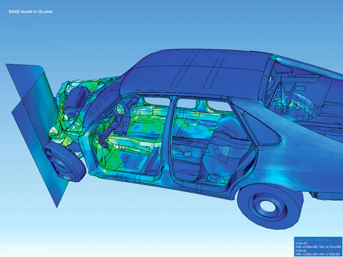
You may have seen images like the one above showing 3D models being deformed. FEA is an incredibly important tool in product design that involves solving extremely complicated mathematical problems by dividing them into simple parts that can be visualized as a dense mesh. The graphical outputs are excellent visual tools to see how parts will deform under certain conditions. Computational fluid dynamics in based on the same principal only with fluid as the medium. This is an evolving area that I'm very interested in and I'm becoming more familiar with this semester in my FEA course.
The almost present GPS

 Intermap is a company that provides digital mapping for countries around the world.
it won't let me post a youtube video for some reason. so click on the link below.
Just another reminder to comment
I just wanted to remind everyone that if you have not yet joined and commented on the Facebook Travel Application event please do so as soon as possible. Also, I wanted to say thank you to Arturo, Francesca, and Garrett for commenting. If you have not commented it is not to late. Your comments do not have to necessarily be travel application specific. For example, you can comment on some features to make the application more user friendly. It should take you less then 5 minutes to comment.
Some of you may not have Facebook. If you do not have Facebook, please comment on this post of what you would like to see in an travel application.
Some of you may not have Facebook. If you do not have Facebook, please comment on this post of what you would like to see in an travel application.
Visualizing Social Networks
Visualizing social networks was interesting to read. It is amazing how it evoluted. I am still not sure about the social component organization that I would like to implement for my hymns' project. Well, should there be any social interaction in the first place between users? I don't know how, and whether or not, there should be a social interaction. Also I don't want to set unrealistic goal, for I would like to finish this project by the end of the semester, which is pretty close. So any ideas about the social feature are welcome. Also, how to implement them, if you give me ideas, would be great.
information anxiety collage visualizer
I realize now that working with the information stream that is twitter is not very appealing to me. It's a little too single-faceted. I don't think it is the type of data that desires to be made sense of. What is appealing is working with Processing and making use of it's ease and design for artists. Getting very good with the Processing language is one of my major goals in life. What is appealing about twitter is it's properties of dissemination. I would like to get better at explaining that both with traditional media and new media.
Information anxiety is a theme in my own artwork and I have perhaps thousands of sketches and no practical way to compile them or analyze them. In a way, these sketches are like twitter for my brain! They have iconography in them, often include text, and are diary-like.
I would like to create a program/softeware/application that can organize and reconfigure my own artwork, sort of like a new collage tool. I want to create new work from my own little crazy sketches. I want it to be more intuitive and easy to use, Perhaps one day another artist would want to work this way with their own artwork. Or, I could easily collaborate with other artists by combining my artwork with theirs.
This is an evolution of my first project that I would like to become a multi-semester endeavor. I would eventually like it to be projected in the REVE aas well as digital prints made. I would like to learn how I can make generative art utilizing these new media techniques while still maintaining my ideas of aesthetics. Also, twitter and other social media techniques could be implemented as I now know how to interface twitter with Processing.
The painting above is by Julie Mehretu, not me!
Sunday, February 14, 2010
Thursday, February 11, 2010
Wednesday, February 10, 2010
Please Give Your Ideas on the Facebook Travel Application
I just wanted to remind everyone that if you have not yet joined and commented on the Facebook Travel Application event please do so as soon as possible. I am planning on doing an initial mock up some of the different components of the application before our class next Tuesday. It would be helpful to have everyone's feedback before I make the first prototype. I especially want everyone in the classes individual feedback. It should take you less then 5 minutes to comment.
Some of you may not have Facebook. If you do not have Facebook, please comment on this post of what you would like to see in an travel application. Your comments do not have to necessarily be travel application specific. For example, you can comment on some features to make the application more user friendly.
Some of you may not have Facebook. If you do not have Facebook, please comment on this post of what you would like to see in an travel application. Your comments do not have to necessarily be travel application specific. For example, you can comment on some features to make the application more user friendly.
Tuesday, February 9, 2010
Anamorphosis

István Orosz Anamorphic Column with Mirror

to see the anamorphic skull embedded in this painting click on it to enlarge it and then view the image from an extreme low angle from the left corner
This technique is also widely used in film to record a compressed image in a small frame (35mm for example) and expand
Here are some examples by Kurt Wenner and Julian Beever, contemporary masters of street art.


Side Project


Being a video game geek, racing fanatic, and engineer can be a handy combination. This is a little side project of mine that I thought I would share, I hope it's somewhat relevant.
I drew up the basic side profile in AutoCAD of what I would need to cut out of MDF board. The dimensions are taken from my own car so I knew ahead of time it will fit perfectly. I stuck the shape onto a 4X8' rectangle (standard plywood) so I knew exactly how much wood I had to buy.
Doing this quick little drawing took less than 30 min and saved me countless hours of drawing it to scale by hand and saved me from buying extra wood. Hope to find time to finish it this weekend, after doing my work for Digital Design and Vis. of course..
Monday, February 8, 2010
Project status
So far so good. I know my idea is doable. Just need to keep doing and learning. I don't really have much new to report.
Speech recognition software
For my project I'm going to consider using speed recognition functions. I found a open source speech recognition project named "CMU Sphinx". I still doubt that that will be an easy task, so I'm planing to include this functionality as an extra module, so the core functions of my application must be useful without speech recognition.
Visualizations using the New York Times API
Hi everyone!
I just made two visualizations using the New York Times API. I do not know how to export the results as a graphic though. How do I do that?
I just made two visualizations using the New York Times API. I do not know how to export the results as a graphic though. How do I do that?
Trompe l'oeil
So, maybe it was just me that had never heard of this before or knew much about it, but the art of Trompe l'oeil has has been around for quite some time. They think the first practice of it was around 500 BC, but become popular during the 15th century.
If you're like me and haven't ever heard of Trompe l'oeil, then what your looking at in these images is just paint and a canvas. The 3d effect is created by the use of light and shadows and the word Trompe l'oeil actually means visual deception or eye trickery. I thought these were really amazing and the second painting is actually from the Sistine Chapel, where Michaelangelo painted several.


Subscribe to:
Posts (Atom)