Showing posts with label analysis. Show all posts

Friday, January 24, 2014

Malcolm in the Middle: More than a Comedy

If you ask me, Malcolm in the Middle is a prime example of pure intelligence in comedic television writing that goes beyond the realm of humor. It is a show that is not only relatable to a vast population, but also uses different techniques to illustrate an initiative I have rarely seen. One episode that I think portrays this idea extremely well is season 2, episode 20, Bowling. 
If you are familiar with the show, you know that it portrays a working class family consisting of husband and wife Hal and Lois, and their four sons, Francis, Reese, Malcolm, and Dewy. Each character has their own specific traits that create the ideal dysfunctional family with all the mishaps and schemes you would expect and also the ones you never would have thought of. Ultimately, it is the chronicles of a family that is in a constant state of battle on the surface, but deep down has a strong and unique love for one another.
I could go on and on about each character and his or her development through the series, but instead I’m going to focus on this one episode in particular and why I think it is so brilliant. It starts with the entire family in the kitchen getting ready for the day. Malcolm and Reese set the scene by asking which of their parents is going to drive them to the bowling alley, and with that, the screen splits in two. The entire episode is an explanation of two different scenarios and the events that transpire because of the decision of each parent driving while the other stays home to take care of Dewy.
It begins with Lois driving the kids, lecturing the boys in the car about their behavior. Then there is a cut to Hal in the car with the boys telling them how the bowling alley is a great place to meet the ladies. The next scene has Lois entering the bowling alley with the boys behind her looking extremely miserable and embarrassed. This shot is interesting because as they exit the shot, without a cut, Hal and the boys reenter, with an entirely different demeanor about them. Now I won’t go overboard by explaining every interesting shot in the episode, because then you would be here all night, but included were multiple shots similar to the style of this one and various split screen moments.
As far as the plot goes, it is interesting to see things unfold. For example, in the storyline where Lois takes Reese and Malcolm bowling, Reese starts out flirting with a girl at the alley, but Malcolm ends up with her. This is unlike the scenario where Hal takes them because Malcolm begins with the girl, but neither of the boys ends up with her. There are many similarities and differences between the two shorelines that seem to bring the intelligence level of the show up in a way that is beyond what you would assume. What I find most fascinating about the episode though is that in the end, there is one final split screen with each parent on the couch and the other entering the house. On the couch they ask how the trip went, and the parent that took them replies simultaneously with the other, “Next time, you take them.” And that is the end of the episode. I love the way that even by the end of the episode, the viewer still has no idea which series of events actually took place.

Malcolm in the Middle is a show that I would strongly recommend. It is a witty and relatable comedy that I think everyone should watch at least once. 

Friday, March 1, 2013

A new way of looking at films

I recently discovered a new tumblr, which is often dangerous to my productivity, but I've found this one particularly interesting as it offers an interesting new way of looking at films.  It is called moviebarcode, and it posts single images, or barcodes, representing the entire course of a movie.  These images are made up of a number of still frames, evenly distributed throughout the movie, which are then stretched upward so that only the main color information remains.  It offers a very nice, birds-eye view of the art direction and overall color tones and moods of a film.  There is also an index so that you can easily look up movies you are interested in.

Movie Barcode from "O Brother, Where Art Thou" (2000)
O Brother, Where Art Thou (2000)
For example, this is the barcode from the 2000 film "O Brother, Where Art Thou".  This was the first film to be digitally color graded in order to make an artistic choice.  In this case, much of the footage was tweaked to make the landscapes look drier and more golden, to fit the setting of the Dust Bowl in the midwest.  This is easily apparent in the barcode, which is overwhelmingly gold and beige.  You can also see, right at the very beginning, how the film starts out in black and white, before the saturation is added back in to produce the color.

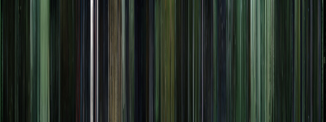
Movie barcode for "The Matrix" (1999)
The Matrix (1999)
Here's another example: The Matrix.  Almost every scene in The Matrix has a distinctive green tint to it, which is easily apparent in this image.

Harry Potter: The Complete Series (2001-2011)
Harry Potter: Complete Series (2001-2011)
This is one of my favorite examples, because it shows some of the applications that these images could have.  This is all eight Harry Potter movies, sequentially, which means we can see some interesting trends.  First of all, we can see that the mood of the series gets progressively darker, until the last installment is almost entirely black.  This visual trend clearly follows the tone of the films and the stories themselves.  It also shows the differences in the styles of the directors; for instance, Chris Columbus filmed the first ones primarily inside, which is shown by all the warm tones at the beginning of the image.  When directing the third installment, Alfonso Cuarón made the conscious decision to shift to a more outdoors, location based film, which is shown in the abrupt transition to blues and greens.

By looking at multiple films at once like this, we can observe patterns, similarities, and differences that are both interesting and useful.  Using these images could be an easy way to examine multiple films by broad categories such as genre or time period, which might expose some of the stereotypes or tropes that are used in different types of filmmaking.

Thursday, April 28, 2011

Mugglenet!

Okay, I know, dorkiest thing possible, but whatever. There's this site called Mugglenet that is a source for basically everything Harry Potter (the title is a link to it). They have news about the movies, books, video games, and actors, caption contests, Harry Potter dessert recipes, trivia- okay, basically, if it relates to Harry Potter, it's on that site.
But this isn't just a post about the site- the creators of the site have a podcast that comes out pretty frequently and has been going on for years. Because the new trailer for the last Harry Potter movie just came out yesterday (if you haven't watched it yet, stop reading and go do that right now), their podcast for this week is an analysis of the trailer. In the last "trailer talk" of theirs that I listened too, they had images from the trailer to go with it so that you could follow along with what they were analyzing. I mean, it's pretty dorky, but if you're really excited for the last movie and you want to try and make sense of some weird clips/shots that were too fast, it's fun. So if you're a Harry Potter fan and you have a few extra minutes lying around, I suggest you go listen to at least a little of Mugglenet's latest podcast. And maybe watch the trailer several more times.

Monday, March 1, 2010

Fractions of a Second: An Olympic Musical


It is interesting how even the New York Times, prodded by falling number of subscribers looks to present data in a way that can truly add to your experience. In this very simple "audiolization" they convert time data in a fun way that our senses can clearly understand. It is apparent from this forage into creative data visualization that the makeup of their work force is actually being renewed. Click on the title of the post to go to the permalink.

Monday, February 22, 2010

Freebase

Since many of you are using or want to use data let's take a look at FREEBASE, which is a special breed of data aggregator, wiki, social network etc. The data is being generated by the users, as is usually the case, and can be utilized by you in a variety of ways, the simplest being to link to it of course. Others can add to your theme or subject etc. By creating your own Freebase you are adding your experience or knowledge about the subject to a bigger comprehensive pool. Of course the internet itself is like that, but these pools are the equivalent of specialized areas of the brain that are more focused on certain subjects, skills or concepts.

For example, I started one as a test called Interactive Storytelling which you would find as a top domain if you searched for those keywords in the Freebase link. I have not used it much at all, but I just noticed that some people actually added related themes to it.

So I suggest you all type some keywords in there and see what other related stuff you find that is of interest to your project. I am sure you will be surprised.

Jorge Luis Borges,
in my opinion one of the most extraordinary storytellers of all times.

Thursday, February 18, 2010

Tableau

I found this very useful site that provides you with a data visualization tool that graphs in a variety of formats and I believe you can come up with your own (in C++) for those of you who speak those OH TOO CLEAR languages:-)

All you need is to find a good set of data, for example from AGGDATA which I showed in class. Some of their datasets are free to experiment with (and make sense off).

Or just search for government databases, there are thousands on every imaginable subject and they are free.
The data can be in different formats, for example Excel spreadsheet, Microsoft Access or plain vanilla text file (like CSV) If you want more professional databases like Firebird, MySQL and such you do have to upgrade. But for playing around and understanding the power of these types of tool the freebies are more than enough)

This example is fully is interactive so you can see lots of relationships. (I decided to just link to it because it kept expiring since it is hosted by the Tableu service. It is also easier to understand and use that way)

Then check their how-to demo, download some formatted data and have fun.