Mostly everyone I know has a list of TV shows they want to watch. One show that has been on my list probably since 2008 is Pushing Daisies, a quirky 42-minute program created by Bryan Fuller (creator of Hannibal) that only ran for two seasons. The show follows Ned (played by Lee Pace), a pie-maker who has the power to bring people back to life with his touch, but then he can never touch them again. He uses his power to solve crime mysteries by bringing victims back to life and asking them how they were killed. His partners include a private investigator, a waitress at the pie shop, and his "reborn" childhood sweetheart.
My immediate reaction to the pilot (aka "Pie-Lette") was pure amazement at the stunning art direction and production design. The whole feeling of the show is very fantasy-like and there is a consistency with how symmetrical each shot is. In a TVGuide interview, production designer Michael Wylie said, "my goal was a storybook come to life. I wanted everything to look almost like an illustration, which he did by concentrating on conflicting patterns in different colors, particularly reds and oranges, but no blues."
This ideal is conveyed right from the start (as displayed in the pictures below).
Ned's mother as she prepares a pie, shortly before she dies (and is revived by a younger Ned). A lot can be told by this single frame. It fits into the color scheme of reds, (the pie, mixing bowl; danger) oranges (kitchen table/hair; vibrance of her personality), in addition to yellows (shirt, wallpaper, curtains; illness[her brain aneurysm]) and greens (skirt, walls; impending doom).
Waitress Olive Snook (played by Kristen Chenoweth) as she recommends pies to a customer. Once again we see the common color scheme of reds, oranges, yellows, and green (and even a bit of purple in there too!).
Voilá! There it is again--reds, yellows, oranges, and greens. (Thank you Michael Wylie).
The whole premise of the show is also very intriguing to me--I've never seen or heard of any other show like this one. From what I've seen so far, the characters are especially unique, which makes for a nice contrast between each of them. It seems as though a frustrating romance will blossom between Ned and his childhood sweetheart Charlotte "Chuck" Charles (played by Anna Friel), since he cannot touch her or she will die. This budding relationship is much to Olive's dismay since we see her flirting with Ned a lot in the first few minutes; she obviously likes him too.
Ned & Olive vs. Ned & Chuck (also note the symmetry of the frame in the picture on the right!!)
The dynamic between Ned and private investigator Emerson Cod (played by Chi McBride) is great because they are this duo who take on these cases and solve them in such a casual manner (because waking the dead for a minute isn't such a big deal, right?). I'm interested to see what other cases they take on in future episodes.
I am a big fan of quirky/art-sy shows and movies (hence my earlier posts about Big Eyes and The Skeleton Twins) so this show is a perfect fit for me. I'm definitely going to find some way to watch the rest of the series (it is not on Netflix, sadly) because the first episode really got me hooked.
This past December, renowned filmmaker Tim Burton released "Big Eyes", a biopic drama about painter Margaret Keane and the challenges she faced with her greedy husband, Walter who takes credit for her paintings. For the duration of 106 minutes, I was completely immersed in the film for a myriad of reasons.
First off, I thought the acting was excellent. It was a nice change of pace seeing Amy Adams play the role of Margaret Keane. She's had many roles over the years, ranging from a happy-go-lucky princess in Enchanted to the seductive Sydney Prosser in American Hustle to the feisty reporter Lois Lane in Man of Steel. Adam's performance as Margaret required her to be more softspoken and less bubbly, which was a big contrast to her other roles. And Christoph Waltz perfectly captured the essence of Walter Keane's persona (a manipulative jerk).
The art direction was fabulous. The costumes, location, and set were all very accurate to the 50's/60's period, and I never felt like any of it was super outrageous, like other Burton films sometimes are. They used color to convey emotions and conflicts at various points, which made the story that much more intense.
The contrasting colors between DeeAnn (center) and Margaret/Walter really heighten the conflict in the scene, where Walter is trying to convince DeeAnn that he is the real painter.
In this scene, the use of red lighting, and the green in the painting emphasize the anger/intensity of the moment between the two (red) and the impending doom of the moment where he begins to take credit for the paintings.
In addition to these specific scenes, Margaret wears a lot of blue tones, conveying her sadness/frustration for keeping her skills a secret.
Since the premise of the film is biographical it definitely feels more real, but the tone of this film was unlike the others. Burton is known for producing/directing films that lean more toward fantasy, horror, and general quirky-ness; Big Eyes does not fit this theme. What I felt made this film unique was how real everything felt, unlike other Burton films such as Edward Scissorhands, Alice in Wonderland, and Corpse Bride. Granted, those are all fantasy, so it's hard to compare them in that sense. The quirkiness of Burton's films isn't my favorite thing in the world, so this was very refreshing.
Overall, I really loved the film. The art direction was fantastic, and the acting was very good. I felt the real-ness of the story, as opposed to past Burton films which are more fantasy/horror. I think this film is a turning point in Burton's career--this was definitely his most mature film yet.
I would highly recommend this film to anyone who enjoys great art, and a story about a triumphant woman who finally gets her dream.
(here is the trailer, for those of you interested)
Over spring break, I was lucky enough to visit the AMC movie
theater in NYC. What’s special about this theater is that, unlike the normal,
relatively comfortable seating that is generally in movie theaters, this place
had beautiful, plush, reclining seats. I cannot begin to express to you how
much more enjoyable my movie experience was, and I would go into further
detail, but I don’t want to get sidetracked.
What I really wanted to talk about was the movie that I saw.
I went to see the Grand Budapest Hotel, written and directed by Wes Anderson.
If there were a way to describe this movie, I would say that it is very “Wes
Anderson” (if that makes any sense). The entire movie was very fast paced both
in dialogue and in action. The storyline was interesting and there were a ton
of stars such as Ralph Fiennes, Adrien Brody, and of course the short
appearance of Bill Murray. But although the story and cast were captivating,
the real star aspect of this movie was the set design and art direction. The
entire film was flooded with bright colors and large, detailed spaces. Here are
a few pictures to show what I am referring to:
If only for the set design and art direction, I would highly
recommend you see this movie. The colors are beautiful and detailed. The
cinematography is creative and the costumes are fitting. I would also highly
recommend seeing this film in a movie theater because all of these things are
much better seen on such a large screen (and of course if you can go somewhere
with comfy reclining chairs, I would recommend that too).
Calling all art directors!! I have stumbled onto a really incredible resource. It is a blog called http://moviesincolor.com. Essentially it takes the color palettes of films and breaks them down to their color spectrums, which it shows underneath a still of the image. You can view a complete list of the films by clicking the Films link at the top of the page. Some of them are no longer available, but there are still some great posts available. I found it particularly inspiring for my film. You can also sort the posts by Cinematographer. The blog was originally created because the writer loved the cinematography of Skyfall, in particular the color palette. I am a big fan of Roger Deakins' work and his stills are particularly captivating.
Here is the still from the establishing shot of Scotland in "Skyfall", Deakins used a lot of tans, off yellows and grays to establish this. We see this throughout the setting.
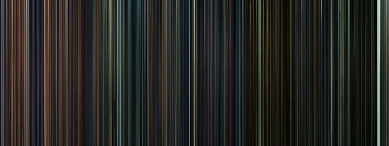
In "No Country for Old Men", Deakins used a great range of yellows and reds to convey the bloodiness of the film.
Overall this blog does a great job of showing how the colors of major motion pictures contribute to their overall tone and message. I like the "Skyfall" image above for our film as well. We are going to be doing a lot of exploring with blues and grays. This will really hold well with the messages and themes that our film is going to be showing. When we introduce our love interest, she will most likely be in red, which will be a great way to pull emphasis and give the moment weight. We are really excited to finalize how the art is going to come together! I hope this helps others with their color palettes for their films!
I recently discovered a new tumblr, which is often dangerous to my productivity, but I've found this one particularly interesting as it offers an interesting new way of looking at films. It is called moviebarcode, and it posts single images, or barcodes, representing the entire course of a movie. These images are made up of a number of still frames, evenly distributed throughout the movie, which are then stretched upward so that only the main color information remains. It offers a very nice, birds-eye view of the art direction and overall color tones and moods of a film. There is also an index so that you can easily look up movies you are interested in.
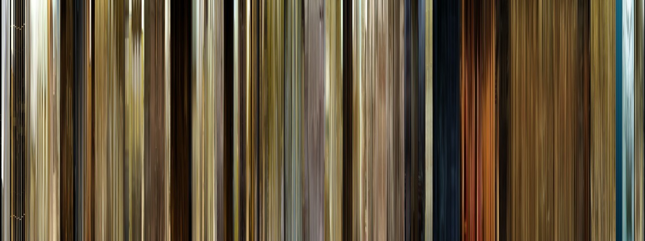
For example, this is the barcode from the 2000 film "O Brother, Where Art Thou". This was the first film to be digitally color graded in order to make an artistic choice. In this case, much of the footage was tweaked to make the landscapes look drier and more golden, to fit the setting of the Dust Bowl in the midwest. This is easily apparent in the barcode, which is overwhelmingly gold and beige. You can also see, right at the very beginning, how the film starts out in black and white, before the saturation is added back in to produce the color.
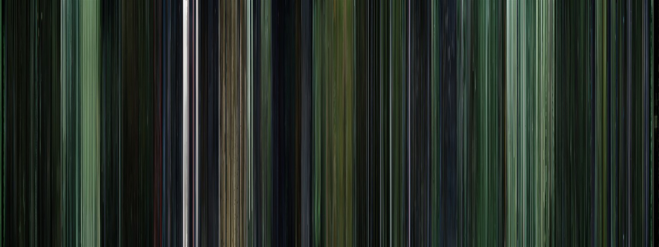
This is one of my favorite examples, because it shows some of the applications that these images could have. This is all eight Harry Potter movies, sequentially, which means we can see some interesting trends. First of all, we can see that the mood of the series gets progressively darker, until the last installment is almost entirely black. This visual trend clearly follows the tone of the films and the stories themselves. It also shows the differences in the styles of the directors; for instance, Chris Columbus filmed the first ones primarily inside, which is shown by all the warm tones at the beginning of the image. When directing the third installment, Alfonso Cuarón made the conscious decision to shift to a more outdoors, location based film, which is shown in the abrupt transition to blues and greens.
By looking at multiple films at once like this, we can observe patterns, similarities, and differences that are both interesting and useful. Using these images could be an easy way to examine multiple films by broad categories such as genre or time period, which might expose some of the stereotypes or tropes that are used in different types of filmmaking.