I recently discovered a new tumblr, which is often dangerous to my productivity, but I've found this one particularly interesting as it offers an interesting new way of looking at films. It is called
moviebarcode, and it posts single images, or barcodes, representing the entire course of a movie. These images are made up of a number of still frames, evenly distributed throughout the movie, which are then stretched upward so that only the main color information remains. It offers a very nice, birds-eye view of the art direction and overall color tones and moods of a film. There is also an
index so that you can easily look up movies you are interested in.
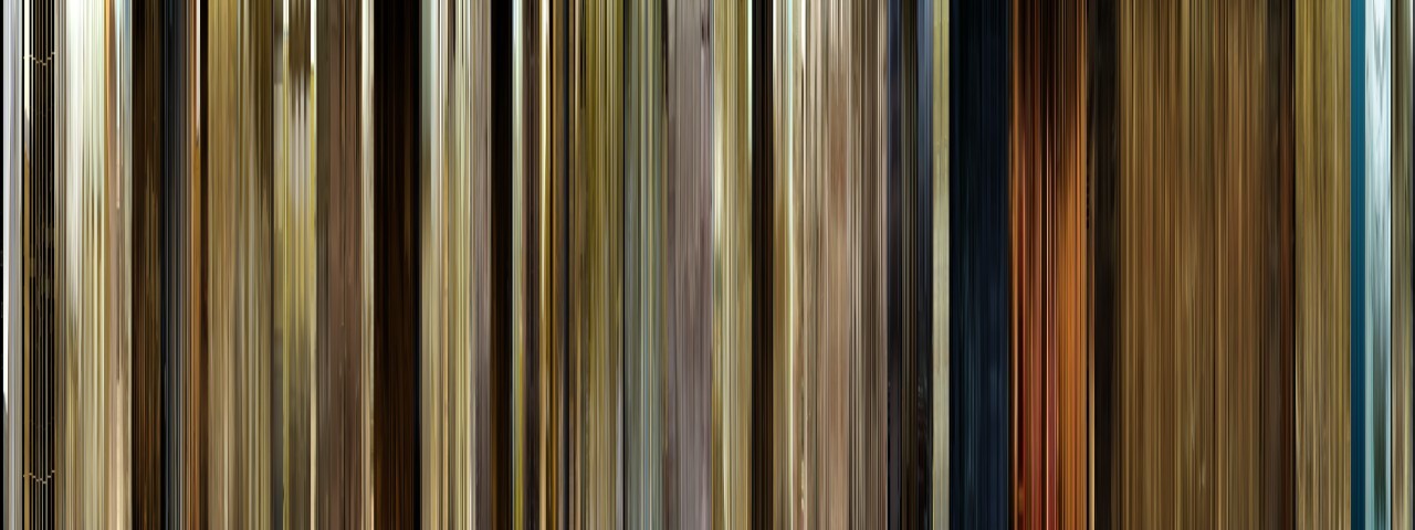
For example, this is the barcode from the 2000 film "O Brother, Where Art Thou". This was the first film to be digitally color graded in order to make an artistic choice. In this case, much of the footage was tweaked to make the landscapes look drier and more golden, to fit the setting of the Dust Bowl in the midwest. This is easily apparent in the barcode, which is overwhelmingly gold and beige. You can also see, right at the very beginning, how the film starts out in black and white, before the saturation is added back in to produce the color.
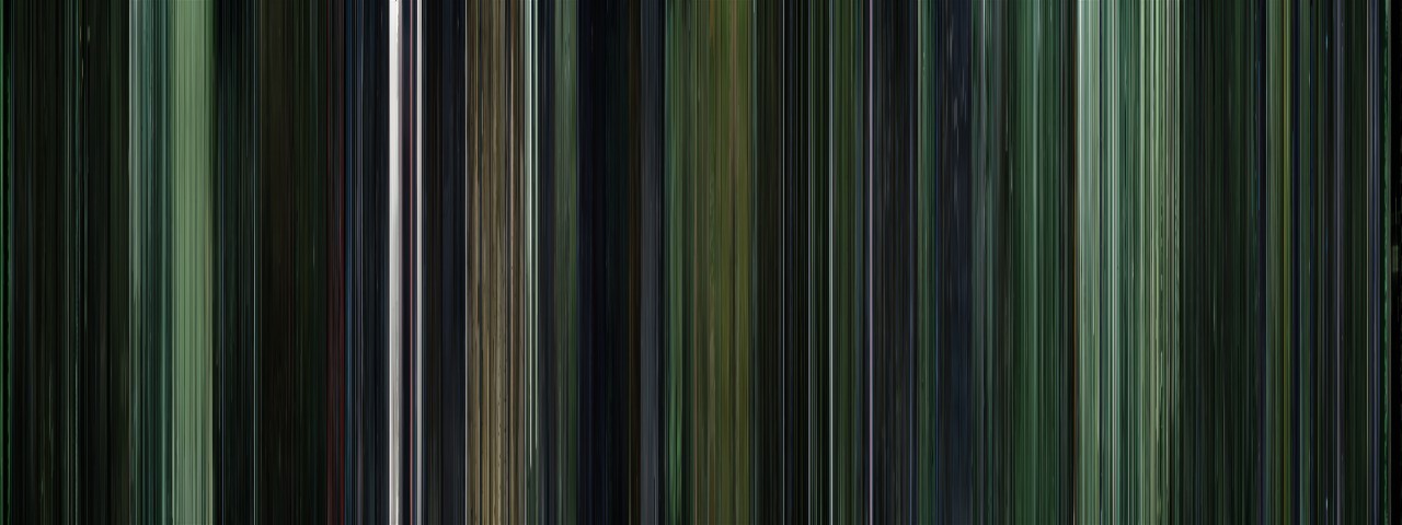
Here's another example: The Matrix. Almost every scene in The Matrix has a distinctive green tint to it, which is easily apparent in this image.
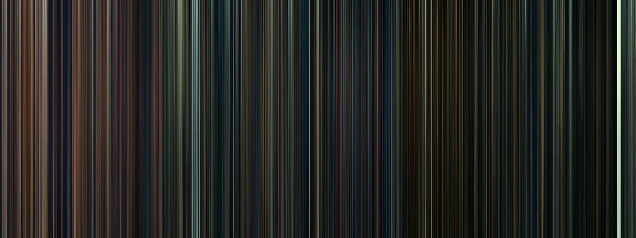
This is one of my favorite examples, because it shows some of the applications that these images could have. This is all eight Harry Potter movies, sequentially, which means we can see some interesting trends. First of all, we can see that the mood of the series gets progressively darker, until the last installment is almost entirely black. This visual trend clearly follows the tone of the films and the stories themselves. It also shows the differences in the styles of the directors; for instance, Chris Columbus filmed the first ones primarily inside, which is shown by all the warm tones at the beginning of the image. When directing the third installment, Alfonso Cuarón made the conscious decision to shift to a more outdoors, location based film, which is shown in the abrupt transition to blues and greens.
By looking at multiple films at once like this, we can observe patterns, similarities, and differences that are both interesting and useful. Using these images could be an easy way to examine multiple films by broad categories such as genre or time period, which might expose some of the stereotypes or tropes that are used in different types of filmmaking.
No comments:
Post a Comment