Showing posts with label Color Grading. Show all posts

Wednesday, September 2, 2015

Color and Why not

Over the course of this summer I shot thousands of photos over a two month period in Ghana. On my arrival home I realized I had enough portraits to make a series. So I set out sifting through and picking the very best of the photos. There were a few decisions I had to make when going into post processing. My first decision was to have them in color or black and white.

Of course I could have both but I wanted a certain consistency to extend through the series. Unlike many of my peers my roots in photography began in a darkroom. I shot on 35mm black and white film for the first two years before I switched over to digital. Because of this I tend to lean towards black and white over color in many of my photo editing decisions. The lack of color in many cases makes some of the photos more tangible to me. The image is less distracting and focus is more on the subject. Especially in portraits. My usual plan is to look at the un-edited photo with and without color. If I feel that the color doesn't add anything to the photo then it becomes black and white.

In the film world of today I feel as if we are seeing less and less black and white films and even less television without color. With newer cameras expanding dynamic range and colorspace at an alarming rate, black and white seems to many people an unviable option. In certain cases its seen as cliche or "retro". I disagree with these statements but I agree that b&w in video is much more of a difficult decision than in photography. In the end it comes down to the decision of the director and what you think will best help tell your story. Choose wisely.


Released in 2013 Ida was an Oscar nominated film in the Best Achievement in Cinematography category


These are some of the photos in my upcoming series.



Friday, April 5, 2013

Color Correction and "Memory Colors"

Your brain is lying to you.  On the left, the top blue tiles are the  exact same color as the top yellow tiles on the right.  Throw this into Photoshop if you don't believe me.  It's trippy.  Source

Since we discussed color correction in class on Wednesday, it brought to mind this article by Stu Maschwitz over at prolost.com.  It's been around for a few years now, but if you haven't read it before, I would encourage you to take a look.  It is a very good look at color correction and color grading, and how the two interact to create beautiful films.  It also dives into some of the details of why being a colorist is so hard.

The main point that Stu brings up is the idea of "memory colors".  What are memory colors?  I'm glad you asked.  To quote:
 Memory colors are colors that are, in the minds of your audience, inseparable from certain common objects or events. For example, the sky is so associated with blue that you might feel that you see those two words together as often as you see them individually. The same goes for green and grass.
The article goes on to explain how to use those memory colors.  Usually, they are so ingrained in our brains that  even if they are not accurate, our brain compensates.  But they look even better when they are actually accurate, which is where color correction comes in.  It is the colorist's job to make sure that any memory colors are faithfully reproduced, both in the color correction process, and in the color grading process.  Even if there needs to be a distinct color "look" in order to set a certain mood or tone, the memory colors need to remain accurate.  Check out the article for more detail, and lots of good examples from various films.  Actually, just check out his entire site.  He's got lots of other good posts on color correction, as well as camera reviews, filmmaking tips, and general all around interesting stuff.

Source: Prolost.com

Friday, March 1, 2013

A new way of looking at films

I recently discovered a new tumblr, which is often dangerous to my productivity, but I've found this one particularly interesting as it offers an interesting new way of looking at films.  It is called moviebarcode, and it posts single images, or barcodes, representing the entire course of a movie.  These images are made up of a number of still frames, evenly distributed throughout the movie, which are then stretched upward so that only the main color information remains.  It offers a very nice, birds-eye view of the art direction and overall color tones and moods of a film.  There is also an index so that you can easily look up movies you are interested in.

Movie Barcode from "O Brother, Where Art Thou" (2000)
O Brother, Where Art Thou (2000)
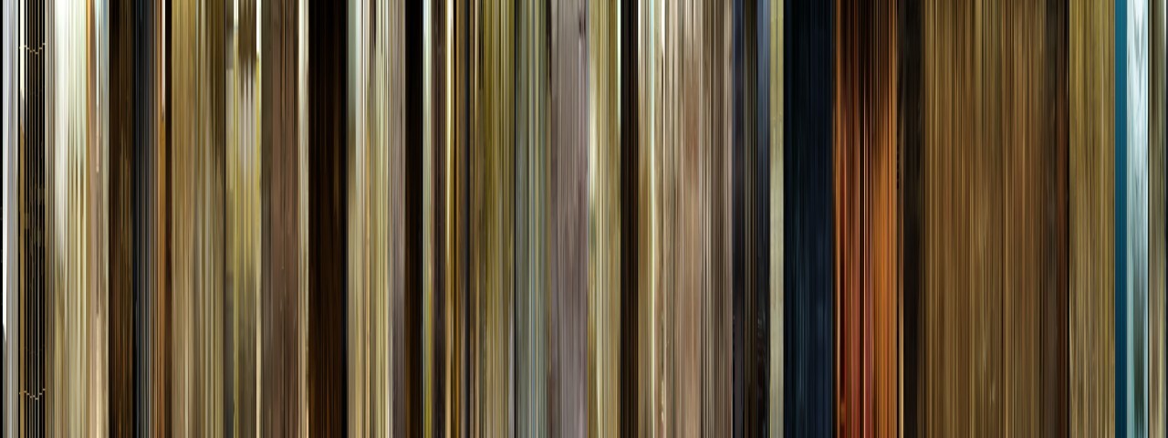
For example, this is the barcode from the 2000 film "O Brother, Where Art Thou".  This was the first film to be digitally color graded in order to make an artistic choice.  In this case, much of the footage was tweaked to make the landscapes look drier and more golden, to fit the setting of the Dust Bowl in the midwest.  This is easily apparent in the barcode, which is overwhelmingly gold and beige.  You can also see, right at the very beginning, how the film starts out in black and white, before the saturation is added back in to produce the color.

Movie barcode for "The Matrix" (1999)
The Matrix (1999)
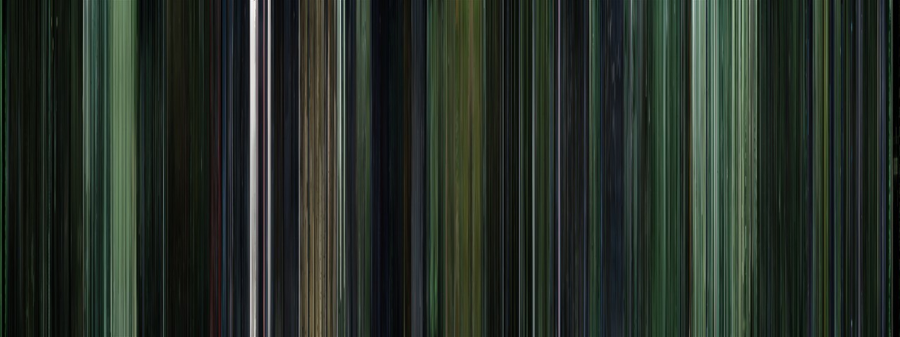
Here's another example: The Matrix.  Almost every scene in The Matrix has a distinctive green tint to it, which is easily apparent in this image.

Harry Potter: The Complete Series (2001-2011)
Harry Potter: Complete Series (2001-2011)
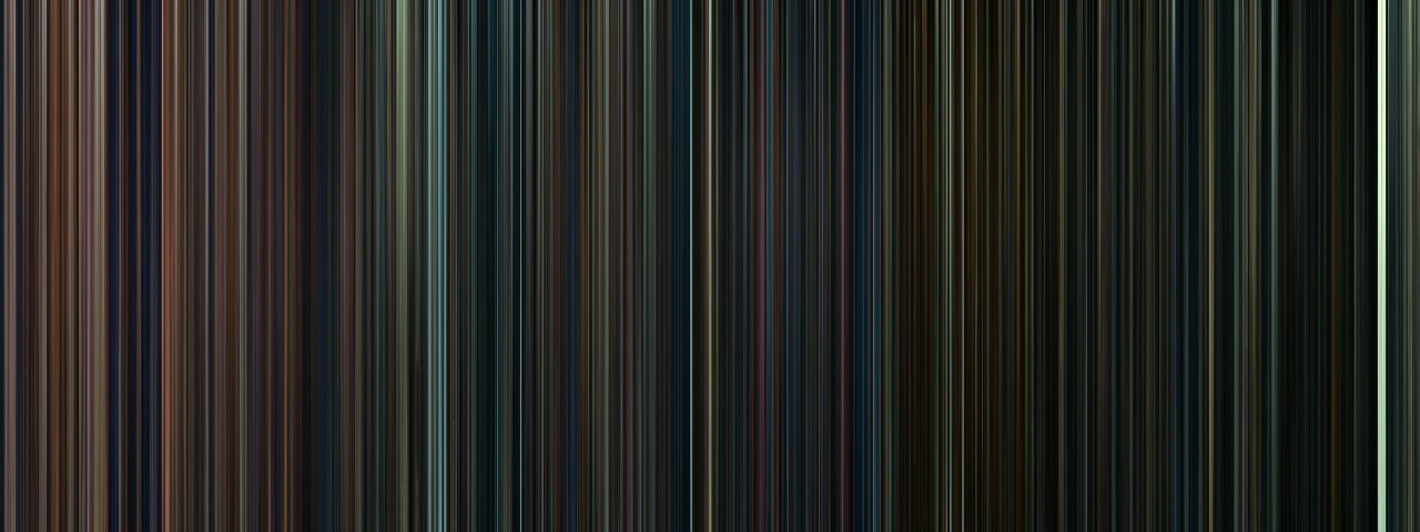
This is one of my favorite examples, because it shows some of the applications that these images could have.  This is all eight Harry Potter movies, sequentially, which means we can see some interesting trends.  First of all, we can see that the mood of the series gets progressively darker, until the last installment is almost entirely black.  This visual trend clearly follows the tone of the films and the stories themselves.  It also shows the differences in the styles of the directors; for instance, Chris Columbus filmed the first ones primarily inside, which is shown by all the warm tones at the beginning of the image.  When directing the third installment, Alfonso Cuarón made the conscious decision to shift to a more outdoors, location based film, which is shown in the abrupt transition to blues and greens.

By looking at multiple films at once like this, we can observe patterns, similarities, and differences that are both interesting and useful.  Using these images could be an easy way to examine multiple films by broad categories such as genre or time period, which might expose some of the stereotypes or tropes that are used in different types of filmmaking.