 |
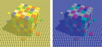
| Your brain is lying to you. On the left, the top blue tiles are the exact same color as the top yellow tiles on the right. Throw this into Photoshop if you don't believe me. It's trippy. Source |
Since we discussed color correction in class on Wednesday, it brought to mind this article by Stu Maschwitz over at prolost.com. It's been around for a few years now, but if you haven't read it before, I would encourage you to take a look. It is a very good look at color correction and color grading, and how the two interact to create beautiful films. It also dives into some of the details of why being a colorist is so hard.
The main point that Stu brings up is the idea of "memory colors". What are memory colors? I'm glad you asked. To quote:
Memory colors are colors that are, in the minds of your audience, inseparable from certain common objects or events. For example, the sky is so associated with blue that you might feel that you see those two words together as often as you see them individually. The same goes for green and grass.The article goes on to explain how to use those memory colors. Usually, they are so ingrained in our brains that even if they are not accurate, our brain compensates. But they look even better when they are actually accurate, which is where color correction comes in. It is the colorist's job to make sure that any memory colors are faithfully reproduced, both in the color correction process, and in the color grading process. Even if there needs to be a distinct color "look" in order to set a certain mood or tone, the memory colors need to remain accurate. Check out the article for more detail, and lots of good examples from various films. Actually, just check out his entire site. He's got lots of other good posts on color correction, as well as camera reviews, filmmaking tips, and general all around interesting stuff.
Source: Prolost.com
No comments:
Post a Comment