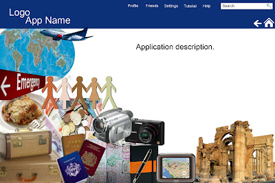
This is my first run at a homepage for my Facebook Application. Each image would be click-able and take you to a different component of the application. For example, the luggage would take you to a section on what to pack based on what other users brought with them. The paper cutout people would have information about different cultures including social norms, customs, laws, etc. The journal with pen icon would allow users to post their itineraries in advance plus blog about their experiences. The emergency sign would contain local emergency information (such as phone numbers e.g. 911 in the USA), information embassies (address, phone numbers, hours, etc.). The camera icon would take you to a place to post pictures that could be made into a personal photo album/scrapbook. The video camera icon takes you to a place to post video. The money icon takes you to a page with currency information also what things in the area customarily cost. This should help tourists from getting taken advantage of. The gps icon is going to provide maps of various areas. The meal icon will send you to a place with restaurant information sorted by location and food category. The sites (ruins) icon provides the different available attractions in an area separated into the following categories: cultural (museums, historic sites), parks, entertainment (live theatre, movie theaters, sports). Both the meal icon and the sites icon will have a place for users to rate cost of each restaurant and attraction. However, the sites page will allow users to provide how much time is needed for the attraction. This will allow users to be able to manage their time better. The map and plane icon will take you to a place for you to log places you have been, where you want to go, and where you have lived. I am still deciding what the exact functions of the passport/passport stamps icon.
I have included a home button and back button, which will make the application user-friendly and easily navigable. Also, there is a tutorial and help area where new users as well as users who may be unsure of how something works will be able to easily figure out solutions.
From research I did on other applications, privacy was an important consideration for users. The settings page will allow users to select who sees what information. They will be able to choose what type of notifications they get. Also, inviting friends to join will be optional to using the application. Although, I'm not sure if a person would have to be apart of the application to see the content their friends generate. The profile section will allow users to be able to network with people who have similar travel interests.
Please provide any comments or feedback you can on the Facebook event page. I am planning on putting this information on the event as well. I really appreciate as much feedback as possible. Thanks again to all those who have provided comments so far.
I'm going to try to come up with some more possible page layouts before next week's class. Hopefully, I should be recovered from my cold by then.
Does anyone know a good resource to learn what can be done with HTML 5? If anyone also knows of any good resources to learn how to code in HTML 5 let me know.
2 comments:
This is a case where I think I would stay away from a "collage" type of design. There are many reasons for that, but I will just mention a few.
Remember the collage sometimes conveys meaning by juxtaposition, but his can have unintended consequences in this case.
For example, the money (currency exchange) is just under the food. Does that suggest food is expensive? There is a sense (for me at least) of contamination associated with food and money.Even worst the food and Emergency sign brings about another relationship that I am sure is not what you want to suggest, even at a subliminal level, and so forth.
Using actual images like the cameras for example, date your site almost immediately after publication, that is why in this cases an icon might be a better indicator. For example the people cutouts (which is the closest to an icon) could indicate your relationships or friends, but you want it to signify something different, so here is where thinking about interface design becomes an essential part of the "rounds of creative".
I know this is just a first mock-up, and it is good because it elicits commentary. Let's see what other people have to say.
The best thing is your project is moving along!!!
When I reread your post I realized another important design issue you must be careful about is navigation itself. Navigation elements (your click-able items) must be present at all times so you don't get lost. If you use those pictures as your navigation you are wasting a lot of screen real state that could be used for additional info, photos etc. Again, even though it is a FB app I would visualize it from the POV of a mobile user, and that would help to tighten your design.
Post a Comment