Showing posts with label data visualization. Show all posts

Monday, April 5, 2010

The Emerging Brain

The reading of Comment Flow, the visualization tool created by Dietmar Offenhuber and Judith Donath established, in my own synapses, a neural connection with memories that as a result are now closer, perhaps fixated in a longer term, or simply transported along a Network Path to a more focused state where I can observe it in more detail. Does any of this make sense to you?

As early as in the 1930's, Jacob Moreno laid down the foundation of the discipline of social network analysis, which is I believe, the basis for Dietmar and Judith study of huge social networks, perhaps never envisioned by Moreno.

One phrase in the study really called my attention:... it is the differences among the people (nodes) and their relationships (links) that create the specific structure of each network and that determine the strength and significance of the ties (p.2). Of course it is common to compare the internet with the human brain, and I do that all the time. The similarities are obvious to me. The strength of a neural connection happens pretty much (albeit chemically) in the same way as the above phrase implies.


Perhaps the internet, the social networks as neural clusters and other yet unknown developments that we cannot even imagine are still in a larvae stage, but the speed at which it grows and the way it interconnects with our own brains, which reinforce the connections, suggest to me that the Singularity proposed by Ray Kurzweil is indeed in track. I hope I get to see the emergence of our evolved brain.

Monday, February 15, 2010

Harmonic Fluids

This is related to the post before the previous, and I find it fascinating. The sounds are generated using an algorithm which is made available for your use if you can understand it! I believe the ray-traced animation was done with 3D Max.


You can download the source code HERE and learn more about this project.

The closest I have gotten to do something like this was by using SuperCollider with which I was able to create very realistic water sounds from scratch but to be honest it was by the time-honored TR method (you guessed it: Trial and Error). Of course I could have put a microphone under water and let nature do the math...but it would not be half as fun for the microphone!

I strongly recommend downloading and using SuperCollider even if you have never attempted to write a line of code. Just by playing with the parameters, as you can do in Processing or PD you can learn an awful lot. (And if Pat is around ask him to give you a push)

Sunday, February 14, 2010

Thursday, February 4, 2010

Ward Shelley


Shelley's work is hard to categorize but it fits very neatly within our field of study. Instead of trying to explain it I will use his own words:


Shape of Understanding

My paintings/drawings are attempts to use real information to depict our understandings of how things evolve and relate to one another, and how this develops over time. More to the point, they are about how we form these understandings in our minds and if they can have, in our culture, some kind of shape.
Usually I choose topics from art or cultural history, such as the arc of an artist's career and its influences, or the effect of particular ideas in an aesthetic or political movement. They are "wide-screen", with all information available to the interacting eye at every moment.

Although his work covers many areas from installation and performance to sculpture and painting (and you can see some here) I want to focus on his mylar oil paintings obviously inspired by the work of Tufte and the Wall Chart of World History of Edward Hull (1890) .

Click on the image titles to see them in large size, they are a lot of fun and you can see more HERE.


All historian's are editors. As such, they must face the problem of throwing the baby out with the bath-water. This is even more my problem. These diagrams are radical reductions of written history for which I have had to choose who and what to include, who not. Incredible amounts of information are jettisoned.* Even the people and works I use are reduced to symbols. But, in their coming together in this different form, new information is revealed, and nearly always a new insight for me.

Ward Shelley

Sunday, January 31, 2010

word frequency in The Hobbit

In my searching for creative data visualization I found this:

Monday, January 25, 2010

Art in Information Visualization

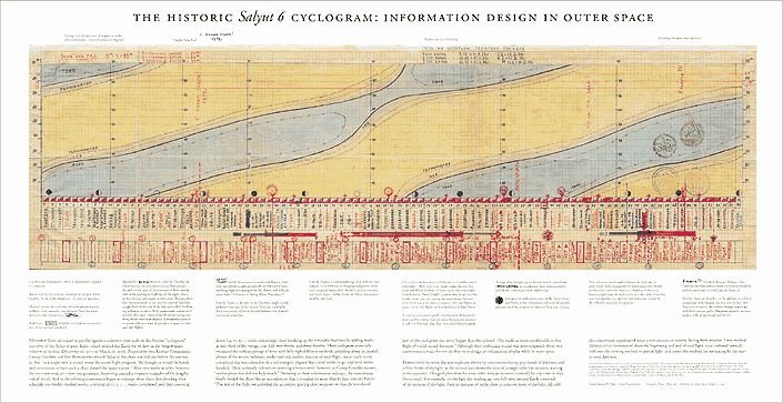
It was a delight reading about "Cyclogram" - a narrative of Salyut 6 space flight by russian cosmonaut, in chapter 5 of Tufte's book.
It is a masterpiece in visualization. So much information- multi dimensional information, all packed so nicely and presented on a piece of paper where one can choose to get the "bigger" picture at a glance or navigate through the details. Complete view, layers of informations, all connected through various dimensions of time and events, again in a mere 2-D paper!! Almost in the same spirit as Hans Rosling did with animated (3D) statistics in the TED video we saw in the class, or perhaps what Google is doing with Google stories.


Thursday, January 21, 2010

information anxiety

Hey everyone! Below is a rough write-up of my idea. I would really like some feedback on what you guys like/don't like about the idea and any questions. Thanks so much.

We are constantly bombarded with information. We are suffering from image anxiety. I check twitter too much. What if their was a way to gauge how active twitter was by looking at a visualization?

Using the data from twitter I want to make spontaneous generated murals. Murals are already somewhat immersive because of the relation of size to a human. This mural would change every time someone tweeted and also change due to topics that are currently trending. That way you wouldn't have to look at twitter to know that a new topic has broken.

I want to use my aesthetic in the art piece I create. I am interested in nondigital art as well as digital (including painting, drawing, & printmaking) so I would like to create interactive pieces that still have that artistic sensibility. I am interested in mark-making that still looks handdrawn or painterly. A lot of my pieces have texture and visual movement so I would like to try to translate that to the immersive environment. Patterns created could also be exported and used as digital design elements, printed artwork, or textile design.

Wednesday, January 20, 2010

Outside the Box


One important thing to remember is that visualization needs not be constrained to the screen but can be a site specific or physical manifestation of something otherwise invisible. One perfect example with which I am sure everyone is familiar with from school is to visualize magnetic fields by placing a magnet under a piece of paper or cardboard covered with iron fillings. But in how many other ways can you extend that concept to show it in different dimensions?

One way is to use ferrofluids which are suspensions of fine iron particles like magnetite or hematite in some carrier liquid medium. Playing with ferrofluids and some powerful magnets can keep you mesmerized for hours. The resultant forms are not only beautiful to watch but they visually depict the magnetic fields in all their glory!


Syntboutique, Installation, Singapore 2008

Another example is a site specific installations or objects like the ones depicted in syntfarm . I see how the Syntboutique installation for example could trigger ideas for the food or smell related projects that we have been talking about in class.

Information Tsunami

Five Years of Infosthetics

I would like to contribute to "image anxiety" by referring you to the work of Moritz Stefaner, an information designer from Germany with a very interesting body of work. But the one I would like to call you attention as a resource, is the piece he designed to commemorate the fifth anniversary of Infosthetics one of the great information design sites.

He made a custom adaptation of his own elastic lists concept to organize the thousands of articles that Infosthetics has generated in the past 5-6 years. Here it is. You can filter it by your subject or category of interest and explore it until you are about to suffer an information attack!. Great site.

Friday, January 8, 2010

ART && CODE

The 2009 Art&&Code Symposium gathered together some of the pioneers of the open source tools intended to democratize "computer programming for artists, young people, and the rest of us."

The Art&&Code symposium series as well as the social network around it was created by Golan Levin, who is a Professor of Electronic Art at Carnegie Mellon and the director of the STUDIO for Creative Inquiry. You can see some fascinating work of his and his collaborators here.

This video is the presentation of Processing, the program developed by Ben Fry and Casey Reas, which is one of the important open source visualization tools that we have at our disposal.

The presentation is a little long but make sure you get to the demos by the various artists they feature and whose work you will surely enjoy and might trigger some ideas of your own.


ART && CODE SYMPOSIUM: Processing, Ben Fry and Casey Reas from STUDIO for Creative Inquiry on Vimeo.

Friday, November 6, 2009

Data and Design

In answer to Edward's previous post, another useful website to know about is called Many Eyes.
It allows users to try out various types of graphic representations of data sets, either their own or sets provided. I thought the graph of football quarterback's salaries on page two was interesting, because what people choose to focus on is telling.