Showing posts with label lighting. Show all posts

Friday, February 26, 2016

God Grew Tired of Us


I've been looking for examples of documentaries about refugees to get a better idea of how to structure a story for ours. I came across "God Grew Tired of Us," a 2006 documentary produced by Christopher Quinn that won Sundance's Grand Jury Prize and Audience Award. The film follows three of Sudan's "lost boys," a group of displaced young men who fled the wars in Sudan in the 1980s and have been living as refugees in bordering countries ever since, as they move from Kenya to the United States. One of the most interesting parts of this film is the beginning. The filmmakers actually filmed them in their refugee camp and got scenes of the boys getting assigned to their new areas (two are going to Pittsburgh, one is going to Syracuse). It even shows them as they take their first plane ride (a highlight is when they're served airplane food and can't figure out what everything is).

The "lost boys" boarding a plane from Kenya to the United States. 
The film continues, and shows them getting acclimated to their new home. The lost boys learn about their new apartment and get introduced to amenities they've never seen before (flush toilets, showers, electricity). They are also shown around a grocery store and learn about common American foods (broccoli, hoagie buns, donuts). These scenes are comical but also very interesting. It's difficult for most people to imagine the conditions these people have lived in for most of their lives, and it's hard to illustrate that. However, in seeing their amazed reactions to things that have become so commonplace to us in America, the audience gets a better sense of where they come from and what things they've been deprived of in their life.

In their first trip to a grocery store, the "lost boys" are offered to sample a donut.
Without including direct interviews, it's also apparent through dirty glances on the street that many Americans aren't comfortable with the "lost boys" living in their community. This is more subtle and, in my opinion, more powerful than having a talking head interview with someone rattling off their xenophobic beliefs. The film is mostly talking heads, which I think is one of the main detractions. It does include a lot of footage of the main characters going about their daily lives — Working, shopping, eating, etc. It just combines these scenes with talking head interviews, which is effective but at times gets a bit boring to look at. If they had just asked them the interview questions while they were working, shopping, eating, etc, then I think the visuals would have been slightly more interesting. 

A typical (and poorly lit) talking head interview from "God Grew Tired of Us."
Another detraction is that the camerawork looks slightly amateur at times. As you can see in the screenshot above, interviews are often very badly lit. It was likely a challenge because the main characters are very dark skinned, but in a seated talking head interview with one subject, I don't think there's much of an excuse for poor lighting. The camerawork in other parts is smooth but uninteresting. You do get the sense that you're given a privileged view, being shown something you otherwise never would have, but the cinematography borders on almost home-video style with little composition. 

Overall, though, this film is a success due to the storyline it crafts. There's a clear beginning, middle, and end. It follows its main characters as they prepare to leave their refugee camp, take their first plane ride over, adjust to their new home, and build a life here. Dani and I would love to have similar scenes in our film, but I know much of that will be unattainable. For one thing, as of right now we can't travel to a refugee camp to film a group of people preparing to come to the United States. We'd love to, but budgets and time obviously wont allow it. We are also doing our best to try to meet refugees who are brand new in the country, as we'd like scenes of people adjusting to their new culture. However, the refugee organizations we're working with are understandably hesitant to introduce us to people who are brand new in the country. They have enough to worry about without having a camera shoved in their faces. It's possibly too lofty a goal for this semester, but Dani and I are both interested in continuing to work on the film after the semester is over. So, given enough time, perhaps the organizations we're working with will feel comfortable enough to introduce us to refugees who have just arrived in Buffalo. 

This film has given me ideas for things we can do in ours. To begin with, I'm thinking more about specific main characters we can follow. At the moment, Dani and I have a good problem: there are so many organizations and refugees in Buffalo that we have almost too many people to talk to. Though we don't have access to anyone who just got here, we do have access to people who have become leaders in the refugee community. I think we should pick two of them and follow them as they work with newcomers and discuss the issues new refugees face. Toward the end of "God Grew Tired of Us," one of the "lost boys" becomes a community leader and works to bring more refugees to Syracuse. I think we have characters who are similar, and I think this could be an interesting storyline that highlights the issues we'd like to address in our film. 

John Bul Dau, one of the main characters in "God Grew Tired of Us," discusses the conflict in Sudan and his life as a refugee. Bul Dau has become a community leader in Syracuse and is working to help bring more refugees over to the United States.
Though we can't follow many of the storylines "God Grew Tired of Us" does (though maybe one day!), I think this film sets an example for how to show issues facing newcomers to this country. Even though it's a bit heavy on talking heads, there are many issues that are shown rather than told to us, and I think that's the standard we should try to achieve moving forward. 


Thursday, November 5, 2015

A New Way to Rent Gear!

As a student filmmaker, you typically only have so much gear at your disposal. Yeah, you probably have your DSLR, a few lenses, and a DIY soft box, but sometimes this isn't enough for your creative needs. As Ithaca College students, we are very lucky to have PPECS, but soon after we graduate we will just be poor college graduates who won't be able to afford the prices of large rental houses without a proper budget. HAVE NO FEAR! There is a new online rental house that may just be your saving grace.

http://kitsplit.com/

KitSplit is a new rental company based out of New York City that functions very similar to Air BnB. Just like Air BnB, the site focuses around a specific area and the resources, in this case camera gear, available. On the site you can create a profile and list the gear that you own and are willing to rent. Other users can look at your gear posted and have the option to rent it from you. This is perfect for students to make a bit of cash on the side. Not only can you make the money back on your gear but this allows you to save up for future gear.

The delivery option is quite unique. You can either arrange a pick-up through KitSplit or directly from the owner of the gear. This option opens numerous opportunities for networking. Each time you would use this service you have potential to make new business connections, you could even get work because of the rental you were picking up for another gig.

This rental service is revolutionary. While it is only in New York currently, they plan to expand to the west coast as well, which is where I think it will do very well. However, the niche market they truly need to target is smaller cities throughout the country. Mainly cities with colleges and universities that have strong communication programs. My thinking is that if this company expanded to Central New York, this would be used as a rental service for colleges like Ithaca, Syracuse, and many more, when the rentals at their school could not provide what they needed.

Overall, I'm looking forward to watching this business grow and expand, hopefully in a direction that benefits, students and filmmakers a like.


Thursday, February 26, 2015

Green Screen

For my blog this week I thought it would be a good idea to talk about green screening because we will be doing this for our film.

How a green screen works:
Firstly Green screening has many different names. Chromakeying and color keying are two different names. This is the process of singling out a particular color in an electronic image and then using computer software to make that color transparent. This allows another image, which can be just about anything you can imagine, to show through.


This sounds very simple and it is for the most part, but there are some things that can make in complicated.


Firstly is lighting the Screen. If the screen is not evenly lit this can cause issues because there will be different shades of green resulting in different variations of transparency. This can completely mess up a chromakey.

Make sure to light your screen properly!

A second issue is lighting you subject to match the image you are superimposing over the green screen. If the light, color, and shadows of the subject don't match, your audience will notice and t will effect your picture. 

Make sure to light your subject according to your setting!

Finally edging. When using a green screen the color of the green can reflect on the edges of objects causing them to also become slightly transparent. This is fairly unavoidable but can be fixed in post with some work. 

Wednesday, February 18, 2015

The Pentatonix and Todrick Halls' "Wizard of Ahhhs"

The Pentatonix are an amazing a cappella group that became famous by winning the third season of The Sing-Off. They combined in 2013 with Todrick Hall, a semi-finalist on American Idol and a YouTube star to create a music video based off the classic movie, The Wizard of Oz. In a sensational way they managed to use modern songs to tell a six minute version of this movie. They of course included the films most renowned song, Somewhere Over the Rainbow, at the end of the video. The lighting was a mixture of flat and natural elements that brought out different feelings throughout the length of the video. For example, it was very bright during the Munchkin City sequence since it was supposed to be happier, and used a lot of darker and green lighting when they met the Wizard of Oz since it was supposed to appear more sinister. One thing that definitely stood out was the coloring. In the beginning, the colors were very desaturated and a sepia tone to go along with the theme of being on a farm during that specific time period. It very closely followed the coloring of the original movie. When it transforms from the drab farm to the land of Oz, the colors become very bright and saturated and make it seem more mystical and dreamlike. The editing of this video consisted of a lot of dissolves into the dreamlike state and cuts when the actions were supposed to be portrayed as more chaotic. They used a lot of closeups of the different characters which really enhanced their presence. Obviously, the main part of this video is sound, and a lot of it is diegetic. It is seen on screen because everything that you hear is coming out of the mouths of the singers and beat boxer. The sound that is created is the motivator for all of the actions on screen and the music describes what they are doing in a creative and different way.

Thursday, February 12, 2015

Lighting in Game of Thrones

**SPOILER ALERT**

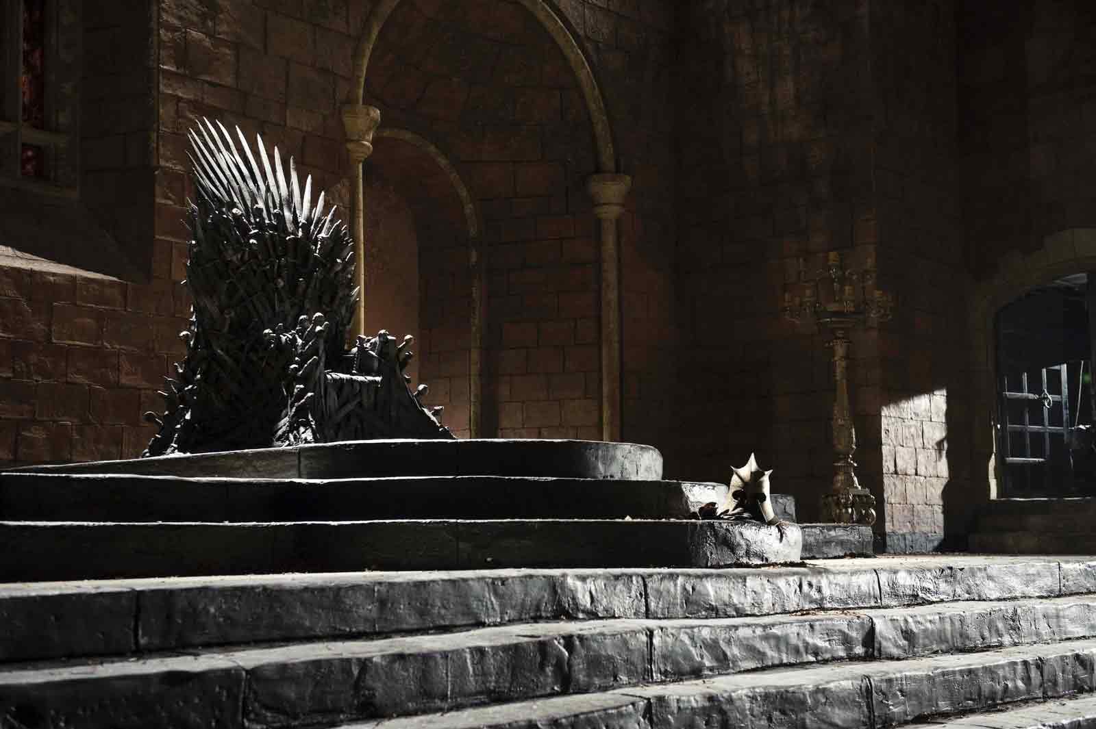
Sticking with our class theme of lighting today, I decided to analyze the lighting of the series I am currently binge-watching — Game of Thrones. The majority of scenes in Game of Thrones take place in three places: Essos (a desert-like continent), King’s Landing (a well-developed coastal town), and The Wall (a city in the frozen tundra of the North). The lighting in the scenes from each place changes dramatically, and perfectly matches the mood and tone of the storylines that take place in each location.


The first location I’ll discuss is Essos, the desert continent. This story line follows one of the show’s main protagonists, Daenerys, as she travels from city to city freeing the slaves and killing their masters, recruiting former slaves who wish to join her army. In the beginning of the series, Daenerys is given to a barbarian-like race called the Dothraki and is made “khaleesi” (queen) of one of the tribes. Her only purpose is to give the “khal” (king) a baby, and she is mistreated as many women in the series are. These scenes are very dark with lots of shadows and warm colors, which does a good job of portraying the mood of the scenes. As time goes on though, Daenerys gains power and begins to form an army. She fights for a good cause and is a very positive character, so her scenes change to being lit with soft, warm light. Daenerys has bleach blonde hair and wears very bright colors, which contrasts the dark, plain colors worn by the slaves she frees. As she gains power and her army grows, the colors lighting in her scenes gets brighter and brighter with less shadows.


The second location, where much of the show takes place, is King’s Landing. As the name suggests, this is where the King and the royal family lives. The storyline in King’s Landing follows two families: the Starks and the Lannisters. Sansa Stark is another one of the series main protagonists, but she is forced to marry into the antagonist Lannister family. While some of the happier scenes take place outdoors with bright colors and full, soft light, the dark and twisted scenes take place inside the castle and are much darker. Since there is no electricity in the time period/world that the show takes place in, everything is lit with candles. The show does a great job of targeting light to make it appear that each room is lit only with candles since there are rarely windows inside the castle, even though the number of candles shown couldn’t possibly create enough enough light to actually show what’s happening. It is interesting watching these scenes, and the lighting is always impressive.


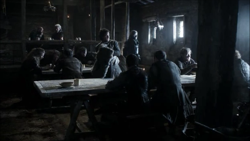
The last major location of the show is along “The Wall”, a giant, 700 foot tall ice wall in the North that travels 500 miles from coast to coast. The main character here is Jon Snow, the bastard child of Ned Stark, father of the Stark family. Jon Snow is a member of the “Night’s Watch”, the defenders of The Wall who give up their life for the brotherhood. Since the North is a tundra-like environment, the outdoor scenes have no shadows, imitating how clouds diffuse the sun when it snows. The indoor scenes are VERY dark, lit with very few candles, and the color palette is always very dark. Jon Snow has lots of personal struggles, and the mood of the storyline at The Wall is usually dark and depressing. The lighting and color palette matches this mood, with all colors either being pale white like the snow or dark brown like their furs/clothes.


Wednesday, January 21, 2015

Benoît Delhomme and The Theory of Everything


Over break, I decided to watch a few movies that were going to be nominated for Oscars. When I first heard of "The Theory of Everything," I thought it was going to be a bland documentary on the life of the well renowned scientist, Stephen Hawking. However, I was drawn in immediately by the beautiful opening sequence. Contrary to the seriousness of the subject of the film, the opening was filled with sunlight and radiant unfocused shots that brought in the audience and made you feel a sense of lightheartedness and beauty. Just from these shots, it was obvious to predict that the movie was going to be shot beautifully. Benoît Delhomme put an amazing amount of effort into the cinematography of this film.


The colors and bright lights that are brought into the film are exaggerated and push the boundaries of what these places and scenes would look like in real life. Colors can bring out so many different emotions, and Delhomme definitely took advantage of that fact. The different scenes were enhanced with colors and effects that made the audience feel like they were inside a story.


Eddie Redmayne's portrayal of Stephen Hawking was breathtaking. In addition to his acting, the way that Delhomme continuously lit his face with bright lights made me feel more connected to the character than I thought I would be. Delhomme used tons of natural light with windows, and I especially remember the shot of Hawking looking outside the window of a train. In an interview, Delhomme states that, "I wanted to see the power of the light everywhere in the film. I thought it was a way to express that Stephen needs the universe around him. Many times I have strong light on him, maybe strong sunlight on his face, because that's the energy he needs."


Overall, the shots in the film were all very rich and bright. In addition to the cinematography, this movie was a beautiful story that I recommend everyone to watch. The acting is tremendous, and there is never a dull moment throughout it. The director, James Marsh, in collaboration with the brilliant Benoît Delhomme created a film that is definitely one for the books.

Thursday, November 20, 2014

The Night of the Hunter

Every christmas my brother and I exchange movies. Usually a film from the most specific categories, something you wouldn't be able to find easily, and have probably never heard of. This annual tradition has yielded some of the greatest films I have seen. One of my favorites to come out of this exchange was a film called "The Night of the Hunter"directed by Charles Laughton (one of the two films he directed). As usual with these gifts, I wondered how he could have possibly found this and why he selected it as this years gift (we always do extensive research before making our purchases). He said "I read the description and it seemed horrifying". And it was. But not in the way that a horror film is scary, but in the way that it builds an eerie suspense that leaves a bad feeling in the pit of your stomach.


The story goes something like this: A man goes to jail for robbery, and leaves the money he'd stolen hidden somewhere with his children. The only person he tells about this is his cellmate, Reverend Harry Powell, a serial killer with the words love and hate tattooed on his knuckles. When the man gets executed for his crimes, Powell decides to try and seduce his wife in order to get the kids to spill the beans. This may not sound like that horrifying of a film, compared to today, but it really really is.

Like with most great films each frame tells the whole story. Just look at how terrifying these images are, even without know the story, they are chilling:


The expressionistic lighting and cinematography (done by Stanley Cortez) builds the unsettling mood. Sound is also a big part of this film, in the same way that the music in Jaws, lets the audience know that something is off, the Rev. Powell's singing acts as a warning that things are going to get ugly. Watching this horrible, creepy man terrorize these children, chasing them into attics, and pursuing them down the Ohio river, is more suspenseful and terrifying than any slasher film. This is one of those films that really gets under your skin, and makes you feel ill. It depends on all of the elements of film to bring out the horror, something I wish more films would do today.


Here's a clip that shows what I mean. The extreme dramatic lighting in this scene really makes it. It heightens the mood and the suspense, and without it the scene would not be nearly as successful.


Wednesday, September 24, 2014

Creating a soft image with the book light

Cinematographer Shane Hurlbut A.S.C. has worked on some films such as Need for Speed, Act of Valor, and Semi-Pro. In which he uses a lighting technique that he describes on his blog as a "Book Light." This configuration and purpose is definitely interesting way to light a scene. Essentially, a book light is any light source which is first bounced creating a soft effect, and then diffused even more through diffusion material such as bleached or unbleached muslin. When positioned the bounce and diff will look like that of a book. Also, now the bounce has become the source of light, making it so that moving the diffusion closer or further away from your subject can change the softness of this light. One last thing to mention is that in most locations this bounce source will probably have light spill everywhere, leading to light bouncing off the walls in many directions. To combat this, having a few flags or draping a large piece of duvetyne fabric in order to block off this light will be extremely useful in order to make the scene have an even look.


Go over and check out Shane's useful blog:
http://www.hurlbutvisuals.com/blog/2012/11/creating-a-beauty-light-with-a-book-light/

Friday, November 1, 2013

Light: The Brightest Form of Art

I was flipping through reddit.com the other day (like a good college student should) and I came across this really cool picture posted on r/pics. He strapped a flashlight to his chest and then took a long-exposure shot. The result was fantastic...

Original reddit post

After being a little inquisitive, I found his personal website: DennisCalvert.net
He's posted dozens of amazing pictures here that he created with artistic lighting, but what I found most exciting was his tutorial section where he explains how he made several of his pictures.


Keep in mind that there is no serious photoshop work going on here. All of these were created with specific lighting tools to create really interesting designs. To see how he made any of these visually stimulating pictures, check out his tutorial page here.

Of course, this blog mainly focuses on films and not photography... so let me reel this in a little.
Because film can not take long exposure shots like photos can, the possibilities become a little more narrow unless you want to use special effects. However, there are still plenty of ways to artistically use lighting. By this point most of us understand the standard three-point lighting system like in this diagram:


When all of them are used, you get a nice looking shot like this one here:


It looks great, but the absence of one or more of these lights is when you can get a really interesting shot. Take for example this shot from There Will Be Blood:


In this shot there is only one light source on Daniel Day Lewis and he is blending right into the background. It really pulls our attention to his face and makes us wonder what his eyes are so transfixed on. 

Here's another example from The Third Man, where one light is creating a dramatic contrast between the character and the environment. 


I pulled all of these pictures from an album I found (on reddit... of course) which explains lighting and color temperature really well. Check it out here.

On a final note, I just want to say that we really do live in a world of free education today. You just need the motivation to find it! 


Friday, October 25, 2013

The Golden Age of Special Effects.

We live in an age of CGI. Hollywood studios have been finding that it is a lot easier to CGI a bunch of enemies or explosions or anything in action and Sci-Fi films. Unfortunately I am one of those people that have not really enjoyed these transitions. Almost all of my favorite action and fantasy films took place in the mid-2000's. Lord of the Rings, Kingdom of Heaven, Mask of Zorro, The Bourne Trilogy. These films had a sense of realism to them that a lot of the more modern action films don't.

Although I thoroughly enjoyed The Hobbit, an Unexpected Journey, the excessive use of animation really took me out of some of the scenes. There were scenes that were exclusively CGI and since I knew it was all CGI, all suspense was immediately taken out of the scene. I think the reason why I enjoyed the big budget action films of the 2000's was because special effects were not good enough at that point to completely shoot a scene, but could only be used to enhance scene. Give them that extra something if you will. For an example I have added two scenes, both from director Peter Jackson, one from the Hobbit done completely in CGI and one from The Fellowship of the Ring, decide for yourself which one has more tension.


Hopefully, you agree with my opinion that the second clip is much better. Mainly because of the lack of frame cluttering. It's almost as if Peter Jackson told the animators to put as much stuff in the frame as possible. This excessive animation really makes it difficult for me at least to get personally involved in the scene. The sad part is, is that a scene shot in a forest with a bunch of guys in costume did so much more for me than and thousands of dollars of animation could.

I am going to bring up a point here that might cause some contention. As some of my classmates have already stated, they really did not like the film Pacific Rim, and while by no means did I think it was a great film. I found it to be very enjoyable and worth the money I spent in the theater (mainly cause I didn't watch it in 3D). Now obviously this film relies on CGI like it is nobody's business, but the thing I found interesting after looking a bit further into the making of the film was that director Benicio Del Toro made a conscious effort to make the cockpits of the Jaegers a real set and the enhance it with CGI. Here is a clip about building the set.


Now I thought that was pretty amazing. Especially because of the lack of necessity. They were already making an extremely CGI heavy set, Del Toro could have just as easily had the actors put in a green screen environment and done everything in post, but he said no. I want to add a sense of realism in an otherwise unrealistic film. This went as far as to make real functioning pilot suits and helmets

Well for those of you who have stuck through this whole post and watched all the videos and listened to all my wild comments I say thank you. I always appreciate a good debate, so if someone has a conflicting idea I'd love to hear their arguments. After all, we're here to learn.

Wednesday, September 18, 2013

The Cinematography of Skyfall

Rodger Deakins, CBE, ASC, BSC, is a British cinematographer who is truly remarkable.  He has worked as the cinematographer on such incredible films as Fargo, The Shawshank Redemption, No Country for Old Men, Oh Brother Where Art Thou? and now Skyfall.  Deakins has been nominated 10 times for the Academy Award for Best Cinematography and each time he has been robbed.  In particular this past award year really bothered me, as Skyfall was one of the most beautiful films I have seen in the past few years.  On top of that, Deakins lost to the cinematographer from Life of Pi, which makes little sense to me, as the film was almost entirely created in post production.  But, that is another story altogether.  I want to take an in depth look at the real reasons why Deakins deserved the 2012 Academy Award for Best Cinematography.  In particular, throughout the film, Deakins' use of light and color is magical.  We see incredibly rich yellows, blues and even some reds.  

First Shot:


Deakins does not waste any time. His first shot starts out completely out of focus.  The only light is coming from behind Bond, he is not front lit at all.  As James Bond walks down the hallway, he moves into focus.  When he move completely into focus, he is lit with rich yellow light only capturing his eyes.  This intriguing scene immediately pulls us into the world of James Bond (only the first 30 seconds are necessary to get the point).


Shanghai:

James Bond pursues an assassin to Shanghai, and then follows him to an upper floor of a skyscraper.  Here Rodger Deakins takes advantage of the beautiful effect that can be found from reflections.  The theme of reflections is something that Deakins plays with throughout the film, not just in this scene.  He uses them a lot around the cell of the villain.  
In Shaghai, he reflects the beautiful neon colors of the city throughout the scene.  Bond and the assasin fight amongst the mirrors and the reflections (and the camera is never in the shot, despite the many mirrors).  The skyscraper is bathed in neon blue, which casts much of Bond and his target into shadow.  This comes into beautiful contrast with the room in the adjacent skyscraper.  The focus on the shots are also incredibly well done (see image below).  


Macau:
Bond follows a lead he received from the assassin to a seedy gambling ring in Macau.  Here we have an insane lighting/color palette.  Deakins and the production team on Skyfall put together incredible lanterns and dragons.  These colors tend to be a very red/yellow/orange palette which contrasts really beautifully off the previous scene in Shanghai.  These lights and colors are tied together with some really impressive crane shots and tracking shots.  This then ties into some fireworks, which we can even see off of James Bond's face.


Scotland:
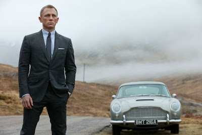
Deakins then contrasts both of these scenes off of Bond's home, Scotland.  These scenes are very misty and washed out and Deakins uses a significant number of wide shots to really show case the beautiful landscape.  The skill with which Deakins captures the landscape reminds me very much of the skill with which Peter Jackson captures the beauty of New Zealand with Lord of the Rings or the way JJ Abrams'  TV series, Lost captured the landscape of Hawaii.  The shots in Scotland start in the afternoon, progress through sunset and end with night shot.   The precision that comes with having to light this transitional period of the day, is huge.  


In addition, the lighting that came from having to deal with the mansion on fire.  Once the mansion is on fire, and everyone is leaving it, they must be lit accordingly.  For this shot Deakins had to bring in a significant number of Dino lights.  


In post production the Dino lights are edited out and the flaming mansion is edited in.  This was an incredibly strong climactic scene of the film.  
I would highly recommend any of Deakins' work, but Skyfall was very strong in particular.  The cinematography of Skyfall really deserved to be recognized in the form of an Academy Award.  

Friday, December 14, 2012

Nicolas Winding Refn

This week, I watched Drive (2011) and Bronson (2008) back to back. Both movies are directed by Refn and feature unusual stylistic lighting, cinematography, and music. Drive, starring Ryan Gosling, is about a Hollywood stunt driver that supplies a getaway car for criminals as long as they pull off their scheme in five minutes with one minute extra and no exceptions. The main character, who is nameless, gets involved with a woman and the mafia. Honestly, Drive is the best movie I've seen in a while. Every shot, Refn uses pink, blue, and yellow lighting somehow and it creates a retro feel that goes with the music. The soundtrack includes modern music that is electronic and reminiscent of 1980s music. Gosling probably has about twelve lines throughout the whole movie but Refn uses music to drive the narrative (no pun intended).
 Bronson, starring Tom Hardy, is similar to Drive in its style. Once again, pink, blue, and yellow lighting can be found in every scene. The story is about Charlie Bronson, Britain's most dangerous inmate. The movie is extremely unusual and it is hard to explain, so just watch it. The music doesn't quite fit with the scenes but at the same time, it works perfectly. Refn uses music that doesn't seem to fit but in a strange way, it works perfectly. I suggest you watch both of these movies. Once you do, you will understand what I mean about the music.


Friday, November 30, 2012

Project Update

Our group began filming our short film today and I have to say, I think we're off to a fantastic start. Footage looks great, everyone did they're jobs incredibly well, and we all made it through, relatively on schedule.

We all woke up at around 7 AM this morning and headed over to Ithaca's First Presbyterian church. The location was perfect. We needed no lighting equipment at all during the shooting of these scenes. Everything is naturally lit and looks wonderful.


We went to my friend's house to shoot a particularly impressive scene in terms of lighting. Since we didn't have a cop car at our disposal, we set up two lights with a red and blue gel on each one, then our grips each waved flags in front of them. It led to what looks like a very realistic cop car lighting effect, and I can't wait to show it off in the final product.

The actors we have did great; we have a particularly awesome Irish cop and our lead did excellent.

Overall we worked very well as both a team and a creative unit and I think we're all going to be proud of the final product we create. Hopefully we can maybe get into some festivals, but as for right now, we'll just focus on making it as good as possible.


And maybe we'll catch up on some sleep along the way.