Showing posts with label colors. Show all posts

Wednesday, September 18, 2013

The Cinematography of Skyfall

Rodger Deakins, CBE, ASC, BSC, is a British cinematographer who is truly remarkable.  He has worked as the cinematographer on such incredible films as Fargo, The Shawshank Redemption, No Country for Old Men, Oh Brother Where Art Thou? and now Skyfall.  Deakins has been nominated 10 times for the Academy Award for Best Cinematography and each time he has been robbed.  In particular this past award year really bothered me, as Skyfall was one of the most beautiful films I have seen in the past few years.  On top of that, Deakins lost to the cinematographer from Life of Pi, which makes little sense to me, as the film was almost entirely created in post production.  But, that is another story altogether.  I want to take an in depth look at the real reasons why Deakins deserved the 2012 Academy Award for Best Cinematography.  In particular, throughout the film, Deakins' use of light and color is magical.  We see incredibly rich yellows, blues and even some reds.  

First Shot:


Deakins does not waste any time. His first shot starts out completely out of focus.  The only light is coming from behind Bond, he is not front lit at all.  As James Bond walks down the hallway, he moves into focus.  When he move completely into focus, he is lit with rich yellow light only capturing his eyes.  This intriguing scene immediately pulls us into the world of James Bond (only the first 30 seconds are necessary to get the point).


Shanghai:

James Bond pursues an assassin to Shanghai, and then follows him to an upper floor of a skyscraper.  Here Rodger Deakins takes advantage of the beautiful effect that can be found from reflections.  The theme of reflections is something that Deakins plays with throughout the film, not just in this scene.  He uses them a lot around the cell of the villain.  
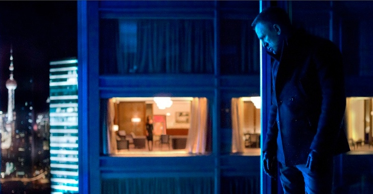
In Shaghai, he reflects the beautiful neon colors of the city throughout the scene.  Bond and the assasin fight amongst the mirrors and the reflections (and the camera is never in the shot, despite the many mirrors).  The skyscraper is bathed in neon blue, which casts much of Bond and his target into shadow.  This comes into beautiful contrast with the room in the adjacent skyscraper.  The focus on the shots are also incredibly well done (see image below).  


Macau:
Bond follows a lead he received from the assassin to a seedy gambling ring in Macau.  Here we have an insane lighting/color palette.  Deakins and the production team on Skyfall put together incredible lanterns and dragons.  These colors tend to be a very red/yellow/orange palette which contrasts really beautifully off the previous scene in Shanghai.  These lights and colors are tied together with some really impressive crane shots and tracking shots.  This then ties into some fireworks, which we can even see off of James Bond's face.


Scotland:
Deakins then contrasts both of these scenes off of Bond's home, Scotland.  These scenes are very misty and washed out and Deakins uses a significant number of wide shots to really show case the beautiful landscape.  The skill with which Deakins captures the landscape reminds me very much of the skill with which Peter Jackson captures the beauty of New Zealand with Lord of the Rings or the way JJ Abrams'  TV series, Lost captured the landscape of Hawaii.  The shots in Scotland start in the afternoon, progress through sunset and end with night shot.   The precision that comes with having to light this transitional period of the day, is huge.  


In addition, the lighting that came from having to deal with the mansion on fire.  Once the mansion is on fire, and everyone is leaving it, they must be lit accordingly.  For this shot Deakins had to bring in a significant number of Dino lights.  


In post production the Dino lights are edited out and the flaming mansion is edited in.  This was an incredibly strong climactic scene of the film.  
I would highly recommend any of Deakins' work, but Skyfall was very strong in particular.  The cinematography of Skyfall really deserved to be recognized in the form of an Academy Award.  

Wednesday, February 27, 2013

The Fall

The Fall is a film set in 1920s L.A. in a hospital where we meet a little girl, Alexandria who has recently broken her arm while picking oranges with her family. She becomes friends with Roy, an actor and stunt double in silent films. He has recently broken his legs and they are possibly paralyzed. He starts telling Alexandria a beautiful story about love, revenge and adventure and uses this to get her to steal Morphine for him.


This film is actually based off another film called Yo Ho Ho,  a Bulgarian film where instead of a silent film actor, Roy's character is a stage actor and Alexandria's character is actually a boy and also is tricked by the Roy character to get drugs.

I've seen posts about this film for a while but have never seen it until now. I'm in love with Lee Pace, so after a bunch of Tumblr posts about it, I finally added it to my instant que.


The cinematography was phenomenal. Even though this film came out in 2006, I want them to resubmit the film and get all of the Oscars for cinematography  Lead Actor and Lead Actress. That little girl who played Alexandria broke my heart. She deeply cared for Roy and just wanted to stay with him and listen to his story. Roy is just so caught up on not being able to act and that his girlfriend has left him for the leading man that he doesn't see how much he's influencing this little girl.

As Roy's telling Alexandria the epic, it breaks the fourth wall within the film universe. At one point Alexandria sneezes and they incorporate that within the dialogue the epics' characters. You also get the narration from Roy and Alexandria's feedback. Once and a while she'll break in and say what she wants to hear from the story. It's an adorable way to play with the imagination of a five year old.


I cried. Yes, I admit it, I cried hard. This is one in a handful of movies that I have actually sobbed during. Lee Pace is amazing in this film. The colors were so vibrant and breath taking, I could just watch it again just to purely look at the color schemes. I mean, just look at Charles Darwin's fur coat (Yes, he's based off of the real Darwin which I found clever since he was still pretty controversial in the 20s). That red stands out so beautifully. Gah! I want to live in those colors!

If you ever get the chance to watch The Fall, I highly recommend it! Bring extra tissues because you will be surprised at how emotional you will get during this film.


Friday, December 14, 2012

Nicolas Winding Refn

This week, I watched Drive (2011) and Bronson (2008) back to back. Both movies are directed by Refn and feature unusual stylistic lighting, cinematography, and music. Drive, starring Ryan Gosling, is about a Hollywood stunt driver that supplies a getaway car for criminals as long as they pull off their scheme in five minutes with one minute extra and no exceptions. The main character, who is nameless, gets involved with a woman and the mafia. Honestly, Drive is the best movie I've seen in a while. Every shot, Refn uses pink, blue, and yellow lighting somehow and it creates a retro feel that goes with the music. The soundtrack includes modern music that is electronic and reminiscent of 1980s music. Gosling probably has about twelve lines throughout the whole movie but Refn uses music to drive the narrative (no pun intended).
 Bronson, starring Tom Hardy, is similar to Drive in its style. Once again, pink, blue, and yellow lighting can be found in every scene. The story is about Charlie Bronson, Britain's most dangerous inmate. The movie is extremely unusual and it is hard to explain, so just watch it. The music doesn't quite fit with the scenes but at the same time, it works perfectly. Refn uses music that doesn't seem to fit but in a strange way, it works perfectly. I suggest you watch both of these movies. Once you do, you will understand what I mean about the music.


Saturday, October 20, 2012

Colors and other Elements in Requiem for a Dream


For the 89398th time, I watched Requiem for a Dream last night with a few of my friends. I’ve always admired this movie for it’s cinematography, whether it was the split screens, the extreme closeups, or for strapping the camera to the actor. However, while watching the film this time around I noticed something that really stood out to me; color. In a lot of my classes recently we’ve been learning about how important color is in any sort of media: photography, television etc. In this film 
In the beginning of the film, there is a strong use of cool colors, showing the calmness of all the protagonists who are not yet in any real trouble. However you start to begin to see the color red a lot more frequently when things begin to go down hill. For example, one of the films protagonist Sarah Goldfarb, has a recurring dream of herself on a television show in the same red dress. She becomes obsessive with this red dress, as she does with being on television. This obsessed begins her downfall and soon more reds show up. Next, she decides to dye her hair a similar shade of red.  These reds really stood out to me more than any other color. The reds played the role as a foreshadow for her losing her mind and symbolized danger in her life and mind. A scene that really portrays this is when she’s spinning around in her red dress and applying red lipstick on herself. This creepy slow motion scene is full of reds, and gives an eerie feeling. The bright red was the only color that would stand out in the scene, making you focus your attention on her and only her. 
Although the other character’s did not have colors that stood out, there was a strong use of cool colors when Harry Goldfarb another protagonist was fantasizing or drugged up. When he lays with his girlfriend doped out, the lighting has a blue tint to it and when he fantasizes about her, the blue sky stands out more then any other color. This represents the tranquility and calmness in his mind. 
This movie has a lot of amazing elements other then colors, the soundtrack adds to the plots mood and the camera shots as mentioned before differ from each other and really stand out. Although this movie has a sad ending and isn’t for the weak stomach, I recommend this film to anyone who loved Black Swan or The Fountain. 

Friday, May 20, 2011

melt

A friend made a model of his chest out of crayons for a class this semester and got the idea to melt the whole thing with candles over a tub of water. He also thought it would be coo to film the whole thing, so he enlisted my help with the coverage of the project. One afternoon we brought all our equipment over to the Cerrache building and set it up. A few other friends stopped by to see how everything was going and to take a few pictures. One thing we didn't realize was just how long it would take to melt the whole sculpture; after about two or three hours the candles had burned all the way down and we had only melted the bottom portion of the model. At one point my friend found a blowtorch in the metal shop and attempted to facilitate the melting process, but even that took a long time. The footage was pretty cool, so I edited it together and put it on YouTube (Vimeo requires you to pay to put anything above 500 MB online). My friend hopes to eventually melt the rest of the sculpture once he figures out a way to melt it quicker.

Originally we decided a section of a song called 'Echoes" by Pink Floyd fit very well with the video we had edited, but once I uploaded it to YouTube EMI blocked the video due to copyright issues. Apparently they don't allow you to use even a section of their artists' work for non-profit purposes and even when you credit the artist for their work. So I had to switch the song for something I was allowed to used, but changing the credits would have taken a very long time to reconvert the Final Cut file and then upload the 1.65 GB QuickTime file; I just left the video the way it was. Anyway let me know what you think.